Lee Miller and Picasso

 23 May – 6 September 2015, Scottish National Portrait Gallery, Edinburgh.

NC0002 1, Lee Miller and Picasso after the liberation of Paris, by Lee Miller, Paris, France, 1944

There are no women artists. Women cannot create. So said the oracles and we thought it must be true. Alice Hubbard, Photography Comes Into the Kitchen, Vanity Fair, October 1921. [1]

I have always admired Lee Miller’s definitive work as an artist, photographer and war correspondent, so I was naturally drawn to this latest exhibition at the Scottish National Portrait Gallery. The relationship between Miller and Picasso is a fascinating one in terms of the visual connection between artist and subject and how male and female creativity are perceived. However the celebrity status of Picasso billed in the press release as “the greatest artist of the twentieth century” is followed by reference to “the beautiful model, who became a skilled and highly influential photographer.” I can think of no reference to a male artist/ photographer or war correspondent in the history of Art or journalism that begins by telling us he was handsome, as if this were his primary attribute. When I visited the exhibition a high school group was introduced to Miller by a guide as “one of the first supermodels” defined by her relationships rather than her work and again my hackles were raised. That she began her career on the other side of the camera is as indisputable as her physical beauty, but in the context of an exhibition in the Robert Mapplethorpe Photography Gallery, in the National Portrait Gallery and as part of the Institute for Photography in Scotland (IPS) 2015 Season, that really isn’t the point. In spite of the problematic framing of the show and its attendant labelling, Miller’s work resoundingly speaks for itself, a perfect counterfoil to the dumb language of celebrity which persistently surrounds it.

As author Ali Smith rightly described in her article The Look of the Moment in The Guardian, Sept 8th 2007; “Much of [Lee Miller’s] life would be a negotiation between the act of seeing and the act of being seen.” In a similar way the viewer of the exhibition must also negotiate these contradictory attributions of value. During the late 20’s and early 30’s Miller was adopted as a muse by the male Surrealist circle; appearing as Cocteau’s painted goddess, a statue brought to life in his 1932 film The Blood of a Poet. When she apprenticed herself to Man Ray, she became his lifelong obsession. The central curatorial conceit of this exhibition is Miller’s relativity to famous men, one Spanish artist in particular, yet in these early years she clearly established herself as an artist in her own right; producing Self Portraits and works such as Nude Bent Forward, Paris, 1930 and Solarised Portrait of an Unknown Woman (Meret Oppenheim), Paris, 1932. Miller also created highly provocative and challenging works;  Untitled, 1930 (Severed Breast from a radical mastectomy) arranged for consumption on a white dinner service and her portrait Tanja Ramm under a Bell Jar, Paris 1931, an apt metaphor for the suffocating ideals of Beauty and the Feminine that still persist today. Miller’s capacity to confront the viewer with uncomfortable truths found real expression and purpose in her work as one of the few female war correspondents and the only one to have seen combat during the second World War. She was present at the liberation of concentration camps at Dachau and Buchenwald, getting so close to her subjects that it is impossible for the viewer to turn away from them. This is the real platform upon which to begin examining her relationships with fellow artists. Unless the general public walk in with prior knowledge or are curious enough to explore Miller’s life and work for themselves the starting point is a step backwards.

The exhibition celebrates the life and work of Pablo Picasso as documented by Lee Miller from their first meeting in 1937 to a final photograph taken in 1970, three years before Picasso’s death. It was a long and enduring friendship, Miller photographing Picasso over a thousand times and Picasso painting Miller six times. The presentation of artefacts, photographs and artworks drawn from the Lee Miller Archives and The Penrose Collection, Scottish National Gallery of Modern Art, create a sense of the great male artist and those in his orbit. However what is infinitely more satisfying is the opportunity to see up close Miller’s insight into the relationships between men and women within a close artistic and literary circle during a tumultuous time in human history. What shines throughout the exhibition is the eye and mind of Miller behind the camera and her connection to Picasso as fellow artist/ seer, rather than a muse.

Picasso, Hotel Vaste Horizon, Mougins, France, 1937, P0110 (1)

In one of Miller’s earliest portraits of Picasso (Hotel Vaste Horizon, Mougins, France, 1937) we see the intensity of his penetrating gaze held at the centre of the composition, an open doorway in the background positioned immediately behind his head, the artist turning to face the photographer. It is a moment of recognition, one of many throughout their 36 year friendship which feels like an acknowledgement, rather than the gaze the viewer is accustomed to seeing in Picasso’s Art- that of an older man beholding a younger woman in desire and ultimately in fear. Miller captured the many facets of Picasso’s personality, his childlike playfulness, his intensity and creative energy. What is clear in both the images of Miller and Picasso taken on 25th August 1944 during the liberation of Paris and in their final embrace in Notre Dame de Vie, Mougins, France in 1970 is their mutual admiration and respect. It is the equality of their gaze and the warmth of their smiles in regarding each other that is most striking. There is a strong feeling of Miller seeing him for who he was, also expressed in Picasso’s gift of Homme et Femme (Man & Woman, Pastel, coloured pencil and wash on paper, 1967) to Miller. The caricature-like depiction of the 86 year old Picasso sitting on a chamber pot with a naked female model (his wife Jacqueline Roque) legs open, face violently distorted, cuts through the myth of male virility and cultural dominance. The drawing acknowledges the vulnerability of age and masculinity in relation to the raw creative power of the Feminine, knowing that Miller would understand the joke.

P0895, Picasso with La Coiffure, Villa La Californie, France, 1956

Miller’s portrait; Picasso with La Coffure, Villa La Californie, Cannes, France 1956 significantly positions the artist in relation to his work rather than his legend. Here Picasso is squatting low on the studio floor flanked by three of his paintings, taller in stature than the artist himself. Miller’s composition positions the artist in front of the fluid lines of a backlit Nouveau window/ doorway, mirrored in the painting on the lower right. Two artists and their ways of seeing are brought into focus in her insightful photograph. Similarly Miller’s son Anthony Penrose, Director of the Lee Miller Archives, framed the love between Miller and Picasso as a creative partnership; “My parent’s friendship with Picasso was a central part of their lives. Beginning from the camaraderie and ideals shared on the beaches of Côte d’Azur it developed rapidly into a love and creative collaboration. Roland Penrose became Picasso’s biographer, the curator of key exhibitions and regarded as ‘The Picasso Man’. Lee Miller lovingly chronicled the men and their achievements. It is fortunate she loved them both as much as she did. A lesser devotion would not have allowed her to tolerate Penrose’s obsessive passion for Picasso.”

One of the most compelling images in the show; Pablo Picasso and Roland Penrose, Mougins, France, 1937 explores this triangle. Here we see a dual portrait of both men, starkly framed by an open car door and bisected diagonally by heightened dark and light. We can see Miller reflected in the psychological barrier of glass and lens in this beautifully composed shot; the light diagonal behind Penrose’s head as he leans, hand behind head in supported admiration of Picasso, a dark diagonal framing Picasso’s head in the lower left, his eyes aligned with the black of the car door frame. The stiff white collar of convention and British reserve are evoked by this dual portrait, together with a darker creative presence. The composition of the photograph and its tonal associations are a powerful part of the three way dialogue. Penrose is elevated, aligned with a higher purpose, whilst the dominant personality of Picasso equally inhabits and grounds the frame. Many years later Miller described herself as a “Picasso widow”, a reference to her husband’s commitment to Picasso and her own.

The way that historical documents interact with images in the exhibition inform the viewer not of Miller’s Dispatches and photographs of the WW2 and its aftermath, but telegrams informing her husband of her safety or a letter from Man Ray to Roland Penrose dated September 24th 1942 enquiring “and what is our little Lee doing?” Although the exhibition press release refers to her important work during this period, the public face of the exhibition and text labels are more concerned with domestic arrangements and personal relationships. Fair play you might say, as this is at base an exhibition primarily about Picasso using Miller’s photographs to document his life. However in 2015 I would argue that the curatorial and educational responsibility is greater than that. Miller is a wonderful example of a woman challenging the conventions of her time and perceptions of the Feminine in her images, writings and actions. The presentation of the exhibition unconsciously puts her back in the “Beauty”, wife and mother box, rather than actively exploring the complexities and contradictions of her life’s work.

In a small photograph of Lee Miller in Hitler’s Bathtub, Munich 1945, we see her head and shoulders as she sits washing away the dirt, grime and experience of war, muddy boots and uniform by the tub. On her right is a white goddess-like statue, in this context the Neo-Classical aesthetic of Aryan propaganda, timelessly ironic in its idealisation of Beauty. Miller glances sideways at this nude, seemingly in distrust, aligned with her own nakedness. It is as if the statue is a reminder of how others perceived her in this private moment, publicly staged. It’s an image of multiple narratives and “many lives” lived by an extraordinary woman that begs further exploration. Whilst I can see the appeal to a public undoubtedly more familiar with the name Picasso than that of Miller, I would expect that this exhibition, which seemingly places her name first, would follow through by example.

Whilst in Edinburgh I also had the opportunity to see an exhibition of cyanotypes by early photographic pioneer Anna Atkins (1799-1871), responsible for the first book to be illustrated with photographs and works from the 1920’s by Modernist photographer Margaret Watkins (1884-1969) at the Stills Gallery/ Centre for Photography (25 April- 12July 2015). Also part of the IPS Season of Photography the information in this show focused attention on each artist/photographer in their own right and the volunteer who introduced me as a visitor to the exhibition was knowledgeable, passionate and the best possible ambassador for wider appreciation of two relatively overlooked photographers. In stark contrast when I visited the National Museum of Scotland’s exhibition Photography: A Victorian Sensation (19 June- 22 November 2015) “meet[ing] the pioneers of photography” didn’t visibly include Atkins or signpost the exhibition at the Stills Gallery for visitors to discover her work. Focusing on the lowest common denominator of the commercial development of photography, its equipment and Fathers of the medium, again the curatorial focus for a public institution was disappointingly narrow. In the UK especially, where historically photography is not regarded highly in the hierarchy of Fine Art, public galleries have a role to play in widening awareness and appreciation of the Art form and promoting equality of representation.

www.nationalgalleries.org

www.leemiller.co.uk

http://www.stills.org

* All images by kind permission of the National Galleries of Scotland.

[1] Alice Hubbard, Photography Comes Into the Kitchen, Vanity Fair, October 1921 (p60). Cited in Seduced by Modernity, The Photography of Margaret Watkins by Mary O’Connor and Katherine Tweedie. McGill-Queens University Press. 2007.

Sam Cartman, Steve Dilworth and Patricia Cain

Kilmorack Gallery, 8 May – 13 June

Moon Sight- Stone

Steve Dilworth, Moon Sight- Stone (Dunite, 60 x 30 x 20cm)

Kilmorack’s latest exhibition combines visions of Nature, Humanity and Industry with paintings by Sam Cartman, pastels and mixed media works by Patricia Cain and a striking collection of sculptural objects by internationally renowned artist Steve Dilworth.

Stylistically this latest body of work marks a high point for Sam Cartman, whose distinctive landscapes capture the mark of agriculture and industry on the land, coupled with the emotional weight of expansive, brooding Scottish skies. In the context of contemporary landscape painting in Britain, it is refreshing to see Cartman’s industrial palette and architecturally structured compositions, coupled with the immediate response of drawn and incised marks in pencil, charcoal and oils. Although from a distance the formal arrangement of form, colour, and line dominate, immediately drawing the eye into the composition, up close there is subtlety and variety in the artist’s handling of paint that is a real pleasure to behold.

2384_1000

Sam Cartman, Tynron Treelines (Oil, 58 x 61cm)

The bold deliberation and planar treatment of fields or sky are beautifully tempered by the textural qualities of thick impasto, using palette knife and brush, delicate washes and impulsive, spontaneous marks. Cartman’s engagement with the picture plane mirrors places where the imprint of human hands and industrial machinery are integrated into the rolling earth, hills and vegetation. These points of intersection between the structured order of the man-made landscape and natural elements are reflected in the artist’s paint handling.

Milnton Byre

Sam Cartman, Milnton Byre (Oil, 58 x 81cm)

Tellingly he chooses to paint a quarry on the Isle of Skye as opposed to the customary scene of misty mountains or an endless parade of picturesque coastal cottages. His art of landscape isn’t about the Romanticised or Picturesque but something more real and complex. The inherent design and physicality of paint create a sense of place somewhere between the rural countryside and urbanity.  This edginess can be seen in the way that paint is layered, pronounced edges, accents of hot orange or red and in the positioning of human architecture. In Milnton Byre (Oil) an out building is set in an abstracted composition of dense yellow ochre, the stark whiteness containing a depth of ultramarine, drawing the eye to a distant horizon of smeared, circular trees in blue and greens. There is a feeling of focused isolation in this work, laid bare in the more abstract painting Elephant (Oil) in a deeper, cooler and vibrant palette of blues.

2416_1000

Sam Cartman, Skye Quarry (Oil, 91.5 x 122cm)

Cartman’s large scale painting Glenshee (Oil) sees the dynamic elements of his style pushed to their limit in an exciting combination of geometric abstraction and natural line. The sky is a progression of deepening tonality from left to right, intersected by white, rectangular impasto and the composition of blue, green, grey and white fields, with linear accents of orange and arched mountains, lead the eye to dwell convincingly at the centre of the composition. The sense of space and depth in the landscape is powerfully realised in the artist’s design, distinctive marks and distilled palette.

2410_1000

Patricia Cain, Thicket II (Pastel, 170 x 170cm)

Patricia Cain’s mixed media works and pastel drawings provide a visual counterpoint between natural forms and man –made structures. Favouring the diptych, Cain creates spaces for contemplation in bisected images of growth; both in the natural world Thicket II (Pastel) and the built environment Arena (Pastel). The division of the image and detailed marks intervenes in how we might ordinarily read (or momentarily scan) images drawn from everyday life. In Arena Cain creates an incredible sense of depth in a myriad of scaffolding, hard metal drawn in the contradictory medium of soft pastel. Out with the tangled branches of Thicket II, she creates negative white space for the viewer’s mind to wander into. There is a sense of mapped chaos in organically charged intersections of branches and foliage; interestingly resembling an aerial, God-like perspective of humanity in a built up urban setting.

2361_1000

Patricia Cain, Arena (Pastel, 186 x 250cm)

In Living as a Process (Pastel) Cain alludes to a human trajectory in young green leaves amongst a tangle of growth, set against swathes of white space, pregnant with creative possibilities.  Whilst the scale of ambition in Cain’s large scale drawings is undeniable, her abstract collaged mixed media works, reminiscent of an aged Matisse, are less convincing. The bold abstraction of Forest (Watercolour and Pastel) displays a more interesting interplay of visual elements; colour, line and form, in a concentrated ground of red hot vermillion. Emotional and spatial depth is created with the utmost economy; with dual vertical lines in white and black receding into the distance, whilst the upright solidity of the tree in the foreground, partially shaded in pastel and with a single curve, brings the suggestion of growth in cool shades of green and blue.

2347_1000

Patricia Cain, Living as a Process (Pastel, 111 x 150cm)

On entering the gallery the gravitational pull of Steve Dilworth’s sculptural objects cuts a swathe through the space. The presentation of this three dimensional work on a series of waist height plinths allows the viewer to get up close from multiple angles and experience the intimately tactile qualities of each work, with directional lighting enhancing the angular precision of their sublime craftsmanship.

Moon Sight-Stone (Dunite) combines Deco-like elegance of line with the grounded integrity of stone, millions of years old. Drawn from the landscape of Harris, the seamless combination of fluid planes and orbital form suggests shifting light and perception, the phases of the moon, the passage of time and of the seasons over millennia. It is the entire cosmos in a single piece of earth; the living, breathing presence of Nature whose beauty lies in being both deadly and Divine. The complex hollows of the orbital cavity shift and change between positive and negative space, darkness and light, waxing and waning before the viewer’s eyes and summoning something deep within. Moon Sight-Stone speaks to the viewer on a primal level. The hollow orb could be an eye or a grasping claw, the flawlessly smooth and dynamically sharp edges of hewn stone polished to perfection with natural accents glinting like stars.  Linked to the legend of Seer Stones it is an object of ancient tradition, Art which has its origins in ritual and the stories we tell to make sense of the world and of ourselves.

Like many of Dilworth’s sculptural forms it is monumentally intimate and naturally ambiguous. Moon Sight-Stone could be an object of communication and sight over vast distances, a shapeshifting bird, or an entire landscape of human consciousness. What is invested in its making translates directly to the imagination of the viewer, connecting us to the impulses and contradictions that make us human.  It is intensely physical and deeply cerebral in its acknowledgement of a way of seeing and being on the earth, linked to tribal or indigenous cultures. It is carved intuitively and engineered with perseverance, the weight of stone beautifully poised and balanced, cool to the touch, lithely evasive in movement to awaken the senses. This is not a sculptural object to be passively looked at and admired, to commemorate history or glorify its maker, but to be experienced and held within, an initiation into collective human memory and to aspects of self we may well have forgotten in the blurring attention deficit of everyday life. Dilworth’s objects have extraordinary clarity of form and intention, they’re not trying to be anything; they are real rather than representational and absolutely grounded in life, death and the human condition.

Swift Kilmorack

Steve Dilworth, Swift (Dunite and Swift, 23 x 9 x13cm)

Many of Dilworth’s objects contain once living material as transitional points in awakening consciousness.  Life and death are eternal dance partners and in an intimate, hand held work like Swift (Dunite and Swift) this centre of spiritual gravity can be sensed and felt in the body. Hollows for the fingers on the underside of the object naturally fit the hands with the thumbs resting in mask-like eye sockets. The apex points towards the body with the weight of stone perfectly balanced , like an object for divining with inward directionality. The robust, masculine form feels like a recently discovered artefact from a long lost tribe, its centre of gravity resting in the collective unconscious. Plumbing the depths of the soul for recognition, this work suggests an innate connection with the timeless human need for Creativity and imagination as a source of renewal.

Throwing Object  Steve Dilworth, Throwing Object (Lignum Vitae, Leather and Bird, 13cm diameter)

Another hand held work Throwing Object (Lignum Vitae, Leather and Bird) is crafted to naturally fit into the palms, the smooth wood and smell of bound, interlaced leather brilliantly melded together. Inside is an archetypal mystery, hidden from view and aligned with the spirit. Rattle (Burr Elm, fishing line and stone pebbles) is reminiscent of Neolithic fertility objects and ritual, with slices of elm creating an open rattle, like the deep crevice of a rock or the female body. As if miraculously confronting a wooden object that has survived over thousands of years, Dilworth’s Rattle is playfully and powerfully aligned with the fertile human imagination, the idea of rebirth and the art object as a bridge between the physical and the metaphysical.

Water Skull

Steve Dilworth, Water Skull Macquette (Mixed Media for Casting, 40 x 37 x 54cm)

Many of Dilworth’s sculptural forms feel as though they are in the process of transformation or becoming. The artist’s Water Skull Macquette (Mixed Media for Casting) is crafted from the inside out, with two halves fitting beautifully together in endlessly fluid, evolutionary form. Every surface, even those we cannot see are given equal care and consideration. It is a fascinating hybrid of outer carapace in the overlapping shell-like interior and inner skeleton in a hinged, oblong outer skull. Part insect, part crustacean and part marine mammal, it is born of natural elements and could be a fragment from an ancient past or a projection of the future once global warming has transformed the planet, returning it to a primordial, aquatic swamp.  The aquiline curves invoke the elemental movement of water, whilst the solidity of the skull creates the impression of an organism built for endurance. As the model for a larger scale work, it would be wonderful to see Water Skull Macquette cast in bronze on a truly monumental scale and exhibited permanently in a public location.

Beaked Bird 2Beaked Bird 1

Steve Dilworth Beaked Bird (Bronze Ed 3 of 5, 20 x 50 x 40cm)

Two versions of Beaked Bird (Bronze Ed 3 of 5), the first in a dark bronze patina and the second finished to a golden patina, reminiscent of organic materials such as aged stone, bone or ivory, is also a transformational and highly ambiguous object. Aside from the associations of its title, the elongated beak sits seamlessly in the hollows of a rounded elliptical form; suggesting the germination of a seed, the embryo of an as yet undiscovered species or a hermaphroditic organism. The combination of masculine and feminine forms is also an intriguing feature of Venus Stone (Dunite). Poised on its side like a reclining nude, Dilworth’s tooth form with sharpened roots links to earlier forms by the artist in alabaster and granite; inspired by hawking lures and ancient fertility statues such as the Venus of Willendorf. The supremely smooth dominant curves of this Venus Stone are essentially feminine; a crescent curve feels aligned to the transformational power of lunar phases and ancient mythology. The object is innately sensual to the touch, like a caress from hip to thigh but with a predatory angularity. Run your finger along the pointed root of the tooth and there is a sonic effect, like an invocation of our most basic instincts whether hunting or hunted. The duality of nature and of human nature, both masculine and feminine, is brought to bear in this work.  It is powerful and subtle; in its soft sheen, sharpened lines and deceptive simplicity, a supremely honed object of complex human behaviour and psychology; sexual, sensual and invested in survival.

Tooth- Venus Stone

Steve Dilworth, Venus Stone (Dunite, 50 x 25 x 23cm)

There are many works in this exhibition to be savoured, enjoyed and revisited. The exquisite crafting of Dilworth’s sculptural objects, both in thought and execution, together with their presentation in the gallery space, naturally invite the viewer to make their own tactile and imaginative connections. The way that the thematic content of Cartman’s paintings and Cain’s pastels inform each other and the rich layers of association in the materials and crafting of Dilworth’s three dimensional objects make this an exceptional exhibition not to be missed.

All images by kind permission of Kilmorack Gallery.

www.kilmorackgallery.co.uk

Alexander McQueen Savage Beauty

Victoria and Albert Museum, London. 14 March – 2 August 2015.

9._Duck_feather_dress_The_Horn_of_Plenty_AW_2009-10._Model_-_Magdalena_Frackowiak_represented_by_dna_model_management_New_York.__Image_-_firstVIEW (2)

Alexander McQueen, Duck Feather Dress, The Horn of Plenty, AW 2009. Image: Victoria and Albert Museum, London

There is no way back for me now. I’m going to take you on journeys you never dreamt were possible. Alexander McQueen.

True to his word, the work of artist, fashion designer and couturier Alexander McQueen is utterly dazzling, emotionally overwhelming and deeply subversive.  Walking into this exhibition is like stumbling into the labyrinth of McQueen’s mind and creative process; extraordinarily rich and fatalistically dark from start to finish.

Savage Beauty at the V&A presents 240 of McQueen’s ensembles over ten rooms in the only major European retrospective of his work. Curated by Claire Wilcox, Senior Curator of Fashion at the Victoria and Albert Museum and Professor in Fashion Curation, London College of Fashion, University of the Arts, London, the exhibition is a homecoming; to the city McQueen loved, to the V&A’s collections which inspired him and to the creative territory of the UK as a place of exhilarated anarchy. It is entirely apt that an exhibition which originated at the Costume Institute at the Museum of Modern Art in New York should find its way home, edited and expanded to include 66 additional garments and accessories loaned from private individuals and collectors; Katy England, Annabelle Neilson, the Isabella Blow Collection and the House of Givenchy.

Whilst the exhibition resoundingly celebrates McQueen’s creative brilliance and extraordinary talent, pushing the boundaries of what Fashion and Couture can be, it is also inescapably a memorial to a life extinguished by its own intensity; embracing the weight of history, emotional extremities of human behaviour and “our unrelenting desire for perfection.”  Part of the strength of this exhibition is that like the conception/ construction of each garment, it reflects the contradictions of McQueen’s Art; bringing together elements of Design, Display, Installation, Cinema, Theatre and Performance to present multi-layered narrative strands and conflicting forces of Nature, including our own.

7._Installation_view_of_Romantic_Exoticism_gallery_Alexander_McQueen_Savage_Beauty_at_the_VA_c_Victoria_and_Albert_Museum_London (2)

Installation view Romantic Exoticism Gallery, Alexander McQueen Savage Beauty at the VA. c Victoria and Albert Museum, London.

On a primal level sound is a significant element moving through each room of the show, creating a sense of McQueen as “a state of mind” and bringing emotional gravitas to each evolving collection of work. Our sense of “shock”, “wonder” and the “sublime” is heightened in the use of recorded memories/ testimonials,  tribal drumming connected to the human heart beat, lush string arrangements, stately orchestrated processionals, pounding Techno and the natural sounds of birds, insects and elements like water to explore recurrent themes in the artist’s work. Ideas of Romantic Exoticism, Naturalism, Primitivism, Nationalism and High Gothic are examined and interrogated throughout the exhibition, revealing the complexity and contradictions that are an intrinsic part of human identity.  McQueen’s fashion shows were never just that, but provocative events/ Performance Art challenging the passivity of parading models of taste and incorporating live elements like fire, thunder and rain. Gainsbury and Whiting the production company that collaborated with McQueen in staging his catwalk shows have worked with the V&A on the exhibition, recreating some of the moments in his career where all of the artist’s understanding, ideas and technique are brought together.

Throughout McQueen’s work there is tension between forces of release and constraint, openly expressed in the sadomasochistic aesthetic of his accessories. The cage- like aluminium and black leather inverted armoury of Spine corset (Shaun Leane for Alexander McQueen, Untitled Spring/ Summer 1998) which psychologically fuses human form with animal instinct, the greatly exaggerated 30.5 cm heels of McQueen’s Armadillo Boot ( Spring/ Summer 2010) which contort the silhouette and constrict the foot in a naturally engineered predatory coil of python skin and the recurrent use of leather masks in relation to the primary garment, which psychologically and sexually transform the wearer/ model into a mute submissive, contradicting  the wearer’s tailored empowerment are all potent examples. Invested in this dominant/ submissive, top/ bottom BDSM tribal language is the silent power of the submissive over the dominant. This ambiguous dynamic of unbridled restraint can also be seen in performance elements of McQueen’s fashion shows represented on film in the exhibition; a model hobbled within a metal frame walking on water or the painfully contorted movement of a model rotating like a captive music box doll, her double belted dress of pristine white cotton assaulted by robotic spray paint to create a unique Haute Couture gown.

6._Installation_view_of__Cabinet_of_Curiosities_gallery_Alexander_McQueen_Savage_Beauty_at_the_VA_c_Victoria_and_Albert_Museum_London (2)

Installation view Cabinet of Curiosities Gallery, Alexander McQueen Savage Beauty at the VA. c Victoria and Albert Museum, London.

Violence in McQueen’s work is part of his creative dynamism; I find beauty in the grotesque, like most artists. I have to force people to look at things. And force us to look he certainly does, from his 1992 Central St Martins postgraduate collection to his final Autumn/ Winter collection 2010, completed after his death. In many ways McQueen turns the extravagance and excess of the fashion world establishment back on itself, literally and metaphorically holding up a mirror to the audience. In a global context the luxury, extravagance and excess of Haute Couture is grotesque, however the hand crafting of garments, attention to detail and visual/ historical literacy invested in each work is undeniably vital as an expression of human creativity. There is an overwhelming sense of McQueen as outsider in the exhibition; driven to deconstruction of clothing, history and of himself. The well-heeled world of High Fashion was not one he was economically, socially or culturally born into; its language, etiquette and conventions had to be learned and exploded as part of his creative trajectory.

McQueen’s training as an apprentice at Anderson & Sheppard in Saville Row, Gieves & Hawkes, Saville Row and as a pattern cutter for Berman and Nathan’s, creating costumes for London theatre shows, London based Japanese designer Koji Tatsuno and Italian Designer Romeo Gigli in Milan, enabled the artist to learn the language of tailoring and couture in order to become “the purveyor of a certain silhouette.” The strength of McQueen’s Art is that his silhouette or brand is innately fluid, often contradictory and politically/ socially charged.  His Jumpsuit ( La Poupée Spring/ Summer 1997) is a statement of iconoclastic precision and arresting Beauty; transforming the social order of a wool suit to create a seamless all in one skin for the body. (Albeit a certain type of female body) A flowing asymmetrical detail of curvaceous fabric extending from the sharply defined lapel subverts an established pattern and is a sublime example of McQueen’s command of tailoring. As an artist he understood that; “you’ve got to know the rules to break them. That’s what I’m here for, to demolish the rules but keep the tradition” . There are many more examples throughout the show of the artist’s elevation of visual language into the realms of the poetic.

McQueen’s Hawthorn Print Frock Coat with dark human hair hidden beneath the white silk lining is alive with predatory, historic and mythic associations.  Here he takes a design popularised in the Victorian era by Prince Albert, worn at formal occasions such as funerals or for business and fuses it with associative raw materials of violent Nature and instinctual human drives. As part of his graduate collection Jack the Ripper Stalks his Victims (1992) it is a dualistic garment of savage violence cloaked in respectability and manners. The concealed presence of human hair, a symbol of sexuality since biblical times, the thorny black pattern of hawthorn akin to barbed wire; invoking the negative lore of the tree and red stained silk implies the business attire of sexualised violence and murder. The multiple narratives within this one garment are beyond simply adorning the body, establishing the social credentials, wealth or good taste of the wearer. The tailoring in this collection is deadly in its heightened precision; a reflection of one of the great legends of London and of barbarity in civilization.  The human condition and mortality is ever present in McQueen’s work, reminding us that however cultivated we may believe ourselves to be, “there’s blood beneath each layer of skin”.

3._Installation_view_of_Romantic_Gothic_gallery_Alexander_McQueen_Savage_Beauty_at_the_VA_c_Victoria_and_Albert_Museum_London (2)

Installation view of Romantic Gothic Gallery, Alexander McQueen Savage Beauty at the VA. c Victoria and Albert Museum, London.

Equally McQueens work can be divinely aspirational, a dress designed for the Autumn/ Winter collection 2010 in flowing silk organza combines the sublime and the sensual in a revelatory way. The fabric is printed with religious iconography from The Virgin of the Annunciation, the 1475 Portinari Altarpiece by Hugo van der Goes. The austere yet gentle monochrome tonality accentuates the female body and its divine attributes. The symmetry of virginal heads and their shadows bring definition and linear grace to the neckline, doves create a natural crease between the arm and the shoulder, hands cup the breasts as givers of life and folds of the painting enhance those of the gown, creating an ethereal vision of femininity and perfection.

McQueen’s perception and presentation of the female body is one of the most fascinating and contradictory aspects of his work. Throughout the show the dimensions of his mannequins and catwalk models are uniformly sculptured, yet what he projects onto the body in his garments and accessories works against type. An ensemble from McQueen’s 2nd collection for Givenchy, Eclect Dissect Autumn/ Winter 1997-98, introduces the idea of metamorphosis; of “a fictional surgeon dismembering women and reassembling them as hybrids.”  The artist creates a commanding image of femininity and power in a dress of black leather, red pheasant feather collar, with resin vulture skulls on the shoulders and the black leather gloves of a falconer, skilled in art of handling birds of prey. The studded shoes, accent of red plumage, bound / angular bodice and fishtail leather skirt heighten the element of danger. This is power dressing which replaces the shoulder pads of the 1940’s and 1980’s with the infinite hollows of eye sockets from carrion birds.

An ensemble from the Horn of Plenty Autumn/ Winter Collection 2009 consisting of a black dress of dyed duck feathers, boots (leather and feathers) with a cap/lace mask is another example of the way that the artist simultaneously contains and emancipates the female form. Here McQueen creates two sets of wings which accentuate the shoulders and hips, elongating the classic hourglass shape with a diamond form bodice at the centre of the couture composition. Like a dark angel or mythological creature the silhouette is imposing and self-possessed, with glossy movement of light on feathers animating the display. The vision here isn’t passive but wilfully ironic. It isn’t a classic hourglass in the pin-up/ popular culture sense; displaying or revealing the sexualised female body (i.e. breasts and hips) for a traditional male gaze. What McQueen presents is arguably more complex and part of an internalised iconography of power and identity, along with his own preference for the base of the spine/ elongated back as the most erotic part of the human body, male or female.

Being a woman in her 40’s of distinctly non-supermodel proportions McQueen’s statement; I want to empower women. I want people to be afraid of the women I dress followed me through the exhibition. Although I can only identify with the perfected dimensions of his models/ mannequins in terms of a critical yardstick to beat myself up with, the idea of metamorphosis and evolution through imagination/ creativity is a powerful and empowering element in the artist’s work, irrespective of gender.  His use of raw materials from the natural world; feathers, horn, bone, shell, hair and skin, together with hand-crafted/ man-made materials; cut Swarovski crystals, forged metal, intricate lace, layers of silk tulle, the exposure of netting and woven tartan reflect his hybridisation of human and animal base matter, forms and movement; pack, clan and tribe.

9._Installation_view_of_Romantic_Naturalism_gallery_Alexander_McQueen_Savage_Beauty_at_the_VA_c_Victoria_and_Albert_Museum_London (2)

Installation view Romantic Naturalism Gallery, Alexander McQueen Savage Beauty at the VA. c Victoria & Albert Museum.

Some of the most exquisite gowns in the Romantic Naturalism room of the exhibition illustrate the universality of human experience beautifully, acknowledging our frailty and vulnerability in relation to natural cycles of growth and decay. The combined use of silk and real flowers as Memento Mori in McQueen’s Sarabande Spring/ Summer Collection 2007 which scattered and fell as the models moved around the runway , the corseted female figure with pastel shaded multi-coloured blooms bursting from within the sculpted confinement of her dress, or the brittle human carapace of the Razor Clam Dress are all potent examples of a wider, emotive field of human experience, sensed and felt in the concept of the garment, its raw materials and elevated, fragile glass cabinet displays.

12._Razor_clam_shells_dress_Voss_SS_2001._Model_Erin_O_Connor._Image_firstVIEW (2)

Alexander McQueen, Razor Clam Shell Dress, Voss, SS 2001. Victoria and Albert Museum, London.

Perhaps the most powerful expression of this individual and collective self-reflexivity can be seen in the finale of his Spring /Summer 2001 show Voss, also known as The Asylum Show. McQueen deliberately kept his audience waiting, confronting them with a vast two way mirrored box in which to see themselves. Once the show began the models were visibly trapped inside a clinical padded space, unable to see out and repeatedly pressing their hands on the glass. The show culminated in the destruction of an inner chamber which collapsed and shattered, releasing live butterflies and revealing a reclining female model of shockingly normal proportions. (Fetish Writer Michelle Olley)  The presence of this “real” female body, her face masked by latex, attached to a respirator and connected to a monkey, feels very much like an acknowledgement of retrograde evolution with our concept of Beauty under the microscope. Framed in this way, the vital sound of “Her” breath is confined within a liberated space of shattered expectations and taboos.

8._Installation_view_of_Voss_Alexander_McQueen_Savage_Beauty_at_the_VA_c_Victoria_and_Albert_Museum_London (2)

Installation view of Voss, Alexander McQueen, Savage Beauty at the VA. c Victoria and Albert Museum, London.

Although McQueen is publicly embraced and celebrated as a uniquely British Artist, the questions he raises in connection with his own heritage and ancestry are still as pertinent as ever. In his Highland Rape Collection Autumn/ Winter 1995, he drew attention to what he saw as “England’s rape of Scotland”. The marketing of Scottish Culture “the world over as Haggis and Bagpipes” does little to acknowledge or celebrate the creative dynamism of the country. The tartan and shortbread picturesque is intrinsically bound up with an age of Empire and Romanticism, reflecting the dominance of one “civilizing” culture over another. In McQueen’s Widows of Culloden  Autumn/ Winter Collection 2006  his use of tartan patriotically and proudly displays an aspect of his identity, coupled with jet beads of mourning and loss; a fusion of historical costume and contemporary drama.

5._Tulle_and_lace_dress_with_veil_and_antlers_Widows_of_Culloden_AW_2006-07._Model_Raquel_Zimmermann_Viva_London._Image_firstVIEW (2)

PARIS fashion week march 2006 READY TO WEAR FALL WINTER 2006/07 ALEXANDER Mc QUEEN

Alexander McQueen, Tulle and Lace Dress with Antlers, Widows of Culloden, AW 2006. Victoria and Albert Museum, London.

What truly inspires in this exhibition is McQueen’s ability as an artist to consistently question the establishment, the audience and himself, renewing his practice through experimentation, a commitment to craftsmanship and detailed knowledge of historical cultural production. His ability to create juxtapositions of conflicting elements that interweave and clash define the unique cut of his silhouette in life and in death. The presentation of McQueen’s remarkable work in synergy with his creative process has created an overwhelming, emotive and dazzling exhibition, exemplified by The Cabinet of Curiosities display. At double gallery height it is an expansive representation of the recesses and imaginings of a creative mind made tangibly real. Every object, garment, and accessory in this sensational exhibition has multiple stories to tell, therein lays its Beauty.

http://www.vam.ac.uk/content/exhibitions/exhibition-alexander-mcqueen-savage-beauty/

Mommy Directed by Xavier Dolan.


mommy

* Warning- this review contains spoilers.

I’ve been recording forever. I’m a watcher. I’m a stalker. I love everything about people. It’s always been a passion for me to observe. Xavier Dolan.

Born in Québec, Canada in 1989, actor, writer and director Xavier Dolan made his first feature at the age of 19; the critically acclaimed I Killed My Mother (2009), followed by Heartbeats (2010), Laurence Anyways (2012) and Tom at the Farm (2013). Released across the UK in March 2015, Dolan’s latest film Mommy (2014) is an intense, visually accomplished, deeply compassionate film and a milestone in the career of its (then) 25 year old Director. Clearly it’s a film made with love and creatively striving towards light; remarkably without judgement about parenting or mental illness. Dolan’s keen observations of human behaviour acknowledge that “good people” don’t necessarily make “good parents” and he establishes beautifully, in visual terms, the complexity of individuals dealing with life the best way they know how. Although the premise of the film may sound familiar; a lone parent trying to home school her violent, disruptive teenage son after he has been expelled from a detention centre, from the opening sequence an unexpected vision is immediately drawn into view.

The 1:1 square aspect ratio creates a portrait orientation and shape of projection familiar to an entire generation as the Selfie. However André Turpin’s cinematography and Dolan’s writing/direction elevate the form beyond the merely self-referential. Although the film was shot in the district Dolan grew up in and the central character Steve is (by the director’s own admission) a projection of his own anger, what emerges is considerably more expansive than just a self-conscious framing device. We are first introduced via a black screen and text to the idea in “a fictional Canada” of an S-14 bill which allows parents to place their out of control children in the care of a public hospital without due legal process. In the opening shot Dolan introduces us to the child in question; clearly a male teenager from the comic book style boxer shorts hung out on the line; his vulnerability made clear by the intimate item of clothing blowing in the wind. In the background, out of focus, we become aware of presence of a woman reaching towards a tree, then plucking an apple from it in close up, her had grasping forwards, childlike, bathed in luminous warmth and sunlight. Before we see her face the camera pans up from high heels to sequined jeans; as Dolan has described in interview (the director designs costumes for all his films) “even before a character opens their mouth their costume speaks”.

When we do see her face of Diane ((Anne Dorval), the camera dwells on her, eyes closed, the character serenely framed in music, sunshine and dignity. In those first few moments we are made aware of her tending / harvesting fruit from the tree and of feminine duality; sensuousness and motherhood. The illumination of this scene resists defining the character stereotypically according to gender or class. Ironically the focus of the aspect ratio/ portrait orientation immediately presents a wider view of possibility in relation to the audience’s assumptions about the character. What we learn during the course of the film is that this single Mum, Diane (D.I.E.) Despres is a widow, devoted to her son Steve ( Antoine- Olivier Pilon)who has been diagnosed with Attention Deficit Hyperactive Disorder (ADHD) and Attachment Disorder.  Dolan’s writing and Pilon’s amazing, subtly nuanced performance allows us to see infinitely more than the diagnosis. Steve is innately volatile, foul mouthed, aggressive, violent and provocative, but he is also childlike, tender, protective and undeniably exuberant; bursting with life, humour and undeniable energy. He is a character who in many ways is trapped inside his own head, unable to sustain relationships, moving from one reactive, explosive episode to the next. Dolan conveys this beautifully through sound, reduced to a bass beat of music and pure adrenalin or offered in contrast to the images we see as a psychological layer of experience and memory. The camerawork is instinctively empathic, it follows close to the characters, the viewer walks behind them, touching the hairs on the back of the neck, almost in their shoes and we gain a felt sense of their perceptive shifts in close up.

In one sequence, we see Steve shot from below in an elevated position on a bridge against bright blue sky, headphones on, with the distinctly minor key piano introduction of Counting Crows song Colorblind leading the audience. As he moves through the streets on his longboard (skateboard), the camera follows beside him like a companion and the viewer hears what the character does not, as he moves to the beat of a mute Rap track. The lyrics of the soundtrack against the confident movement of a guy we could pass in the street on a brilliant sunny day but never really see, convey the sadness and isolation within. He is a child; “Taffy stuck and tongue tied” and a young man on the cusp of adulthood; “I am covered in skin, no one gets to come in, pull me out from inside, I am folded and unfolded and unfolding, I am colorblind”… “coffee black and egg white”…“I am ready, I am ready, I am ready, I am fine.” Dolan consistently delivers more than just a Hipster soundtrack with a range of sound and music that informs our understanding of the characters and their predicament, not simply mirroring emotion or action on screen but revealing their emotional and psychological core. Dolan’s soundtrack is also significantly dominated by a mixed tape from Steve’s dead Father.

The cycles of life punctuated by inner cycles of emotional connect and disconnect are visualised in the poignant and poetic sight of Steve playing alone with a shopping trolley, spiralling into a destructive act. The adults in his orbit are equally prone to rage when pushed to the limit and there are times when the roles of parent/ care giver and helpless child are visibly reversed. When Steve and his mother Diane befriend their neighbour Kyla (Suzanne Clément ) who literally and metaphorically cannot express herself, it is a catalyst for change in all their lives. Although we do not entirely learn Kyla’s backstory, it is clear that she has moved with her boyfriend and child away from some kind of traumatic incident. An ex- high school teacher on “sabbatical”, not yet ready to go back to teaching kids and with a portrait of a blonde male child, not unlike a younger Steve, absent from the home implicates loss. When Kyla agrees to help with Steve’s home schooling to allow Diane to go out to work she begins to blossom, her stutter improves and she begins to bond with the teenager and his Mother. We learn that when Kyla comes to dinner with Steve and Diane it is the first time she has been out since they moved and as they dance in the kitchen to Celine Dion’s On ne change pas, a perfectly pitched reference to our hidden selves, we see aspects of all three characters begin to unfold, in the acceptance of each other’s company. In this context Steve in nail polish and black eyeliner dancing with two older women harks back to a glance he exchanges with another boy in the street and removes the idea of seduction from the scene. Steve serenades Kyla and the viewer simultaneously, the camera and audience becoming a partner in the dance.

This intimate focus expands visually in a street scene where Steve’s hands and outstretched arms expand our physical and metaphorical view to widescreen and Diane, Kyla and Steve take a turn in the road, albeit temporarily. Hope is at the core of this film in spite of the raw and uncompromising exchanges between its central characters and the cruel inference of fate. One of the most affecting scenes is a time lapse sequence set to a cycle of syncopated string music, Ludovico Einandi’s Experience, increasing in tempo as Diane’s hopes and dreams for her son are visualised. At first we cannot tell if these are actual memories or aspirational dreams. Like Steve’s mother having taken the journey with the character we are conditioned to want the traditional happy ending; the graduation, the girlfriend, the marriage, Steve’s dream of getting into Julliard realised,eventually leaving his Mother to pursue his own life and freeing them both. Gradually we spin out of focus and reality hits, it’s raining and Diane is still stationary in the confinement of the car, driving her son to be committed to an institution. It’s an act which tears them both apart but also as Diane states; “I sent him there because I have hope- I am full of hope”… (and) “hopeful people can change things”-a statement by a director in a generation of uncertainty.

In the final frames as the institution guards release the straps on Steve’s straightjacket he bolts down the corridor, a range of expressions flit across his face from mischievous child to absolute determination and we follow in slow motion as he launches himself towards a a floor to ceiling window. Is he about to literally throw himself through it and fall to his death– or like the director transform that window into another self-referential frame? The black screen, all that we’ve witnessed and Lana Del Ray’s Born to Die invite us to draw our own conclusions.

All three lead performances in Mommy are exceptional and the quality of Dolan’s whole production make it a deserving winner of the Jury prize at the 2014 Cannes Film Festival, France’s César award for Best Foreign Film 2015 and Canadian Screen Awards for Best Motion Picture, Achievement in Direction, Achievement in Editing and Best Original Screenplay. Mommy is a powerful reminder of the way that our world and individual horizons expand with hope and rapidly diminish without it. Dolan’s sixth directorial feature The Life and Death of John. F.Donovan starring Jessica Chastain is currently in pre-production and I know I won’t be alone in looking forward to its release.

Mommy- International Trailer

https://www.youtube.com/watch?v=d7rtSqI0ZeA

Interview with Xavier Dolan on Mommy, family and John F. Donovan – YouTube

https://www.youtube.com/watch?v=bNWxa3qsMqU

The American Society of Cinematographers (ASC): Mommy – Interview with Xavier Dolan – The Film Book by Benjamin B.6th February 2015.

http://www.theasc.com/asc_blog/thefilmbook/2015/02/06/mommy-interview-xavier-dolan/

Listen to the Soundtrack For Xavier Dolan’s ‘Mommy’- Film Stage, Leonard Pearce October22, 2014.

http://thefilmstage.com/news/listen-to-the-soundtrack-for-xavier-dolans-mommy-featuring-oasis-dido-lana-del-rey-more/

From The Forest To The Sea-Emily Carr in British Columbia.

1st November 2014 – 15th March 2015. Dulwich Picture Gallery

When I had discovered my subject, I sat before it some while before I touched the brush, feeling my way into it. Asking myself these questions, what attracted you to this particular subject? Why do you want to paint it, what is its core, the thing you are trying to express?  

Emily Carr

Photo of Emily Carr

Harold Mortimer-Lamb, Emily Carr in Her Studio, 1939, silver gelatin print, Promised Gift to the Vancouver Art Gallery from Claudia Beck and Andrew Gruft. Image courtesy of Dulwich Picture Gallery.

Whenever I arrive in a new place I look for artists of all disciplines, historic and contemporary, to really come to grips with the ground I’m standing on. In 1995 I had just arrived in British Columbia on a Canadian working holiday and exploring downtown, found my way to the Vancouver Art Gallery. Noting an artist’s name in my guidebook whose work I had never seen and a floor devoted to her on the gallery map, I ventured upstairs. The moment the lift doors opened I was confronted by a face I have never forgotten, an enlarged detail from Harold Mortimer Lamb’s 1939 photographic portrait of Emily Carr in Her Studio. What struck me immediately was the artist’s powerful, resolute stare; an aged face framed by swirling brushwork, Sunshine and Tumult, the still eye of a storm raging against the intrusion of the camera. In defiance of time and gender this was a woman unapologetically direct in vision and action, arching eyebrows and steadfast, penetrating gaze forever fixed on the photographer and confronting the soul of the viewer.  As I entered the first room I felt elated at the sight of Forest, British Columbia (1931-1932, Oil on Canvas), astounded by the depth and energy of Carr’s paintings and amazed that a degree in Art History had not introduced me to her work. It was a discovery that shaped my consequent journeys through Canada; to Carr’s home and final resting place in Victoria, the Dallas Road cliffs, Beacon Hill Park and Esquimalt where she walked and sketched outdoors, to Ucluelet on the West Coast of Vancouver Island, Northern BC, Alert Bay (Cormorant Island), Haida Gwaii (The Queen Charlotte Islands) and Alaska .I sought out her work in collections across Canada, her writings in second hand bookstores; Klee Wyck (1941), The Book of Small (1942), The House of All Sorts (1944), Growing Pains: An Autobiography (1946) The Heart of a Peacock (1953),Pause, An Emily Carr Sketchbook(1953), Hundreds and Thousands, The Journals of an Artist (1966) and spent countless hours in museums, libraries and archives trying to understand the extraordinary artist behind that formidable gaze.

I think what I also felt, but did not begin to understand until I had experienced the land, sea and forest of British Columbia for myself, was Carr’s profound affinity with Nature and her indigenous understanding of landscape. Contemporary scholars have been critical of Carr’s appropriation of Aboriginal Art and Design in her early work, reading it as part of a condescending colonial narrative of vanishing cultures. But to frame her entire output in this way is to miss something vital which was alive in her work from the beginning. All her life she strove, often at great personal cost, to understand- both as an artist and a human being in spite of her Victorian/ British colonial upbringing. There is respect and reverence in her mature work, in creating a visual language of her own, which shares a kinship with indigenous understanding of nature, environment and spirituality as a living tradition of seeing / being in the landscape. As she wrote in Klee Wyck in contemplation of Zunoqua, the wild woman of the woods; “The power that I felt was not in the thing itself but in some tremendous force behind it that the carver believed in.” This life force which Carr explored through Christianity, Theosophy and Pacific North West Coast Aboriginal beliefs is the defining characteristic and ultimate trajectory of her Art.

For Carr the forest was the Feminine personified; aspects of self, untamed, sometimes threatening, endlessly fertile and Divine. The affirmation of her palette and paint handling in this context is undeniable and although the myth of Carr looms large, her work is also a means of addressing the innate complexity of identity and belonging, particularly in a post-colonial New World environment. Throughout her life she was considered an eccentric outsider, a woman who unconventionally chose not to marry and have children, who travelled to aboriginal communities throughout the Pacific North West coast from the early 1900’s and to San Francisco, Britain and France to gain an Art education.  Until aligned with the all-male Group of Seven in Eastern Canada, Carr remained unappreciated as an artist until later life, emerging as a unique voice from the West, a Modernist way ahead of her time. Today she is embraced, though not without controversy, as a national treasure and the current exhibition of her work at the Dulwich Picture Gallery will no doubt be revelatory to many as the first dedicated exhibition of her work in the UK.

The curatorial vision of the exhibition moves consciously from “darkness to light”; deep forest to sky, revealing the evolution of Carr’s thinking in relation to her Art and the world around her. Juxtaposed with Carr’s drawings and paintings are First Nations sacred objects; Art of ritual and everyday life, which affirm a way of seeing and being in the landscape in terms of reverence, respect , understanding in the use of natural materials and continuity of ancient beliefs and traditions. Many of the objects on display are associated with the Potlatch; a North West Coast ceremonial gathering of families to announce births, give names, inherit rights and privileges,  conduct marriages  and mourn the dead. Dances, feasting and the distribution of gifts such as blankets, carved cedar boxes, food, coppers and canoes maintained relationships between clans, established rank in society and were part of an economy of giving.The Potlatch was banned by the Canadian government from 1885-1951, throughout Carr’s lifetime (1871-1945) and within the display of First Nations Art there is a tension between the intention of appreciation; the beauty and exquisite craftsmanship of this work, its complex social/spiritual/cultural meanings and the knowledge that many objects like these were confiscated by government agents or stolen, becoming part of museum collections on foreign shores, including our own.

 Emily Carr sketching on the beach

Emily Carr sketching on the beach at Tanu, Haida Gwaii (Queen Charlotte Islands), 1912. Image F-00254, courtesy of the Royal BC Museum, BC Archives. Image courtesy of Dulwich Picture Gallery.

A 19th century Haida Raven Grease Bowl (Wood. 10.5x 25.5 x 13cm. Horniman Museum, London.) is functional, mysterious and exquisite ,with its beautifully seamless flow of carved ovoid forms and transformative masks within the body of a bird associated with all Creation. Seeing Carr’s 1931 painting Tree Trunk (Oil on Canvas) nearby immediately communicates something beyond the pictorial; a depth of purple, curtained ultramarine and vivid green; the red cedar like a human figure becoming part of the hallowed earth in bands of fluid colour and light. Like all of Carr’s mature work it conceals and reveals the great mysteries of life and being. She is not a landscape painter of trees or scenic views but grapples with creative forces within and without, going out to meet them in the forest with her “whole self”. When you look into the interior of a decaying cedar, see the erosion of wood by the ocean with its distinctive pattern of grain or the towering strength of Old Growth trees that have outlasted many human generations, there is a sense of connection with being small in relation to the world and with a reality beyond the physical. The same grain of resilient life, delineated in ovoid form in the heart of a cedar, can be seen in the abstracted designs of master Haida Artists such as Bill Reid, Charles Edenshaw and Robert Davidson, drawn directly and holistically from their environment.

A Soul Catcher; (Northern Northwest Coast, 19th Century .Bone, string and abalone shell.15cms. Pitt Rivers Museum, University of Oxford.) a shamanic object intended to hold and protect the soul of an ill person until it could be returned to the body, feels like an apt symbol of the restorative aspect of human creativity ever present in Carr’s work. Her engagement with the coastal forest of British Columbia was a creative act of going deep within, beyond what she could see with her eyes, being still and prepared to listen, restoring her disassociated soul to her body in a world of strict Presbyterianism , Victorian constraint and advancing industrialisation.  Her descriptions of the forest and sea in her writings and her visual language present a human being open to the sensuous and experiential. Her writings on Art, Nature and her paintings are rapturous, heartfelt and revelatory.  Works like (Forest 1935, Oil on canvas) capture reverberations of colour and light in swathes of movement, the vertical upright of the tree at the centre of the composition; a shimmering path into the woods and ever upwards, a representation of her lifelong quest for light. In Hundreds and Thousands, the artist’s journals from 1927 to 1941, she wrote;

It seems as if these shimmering seas can scarcely bear a hand’s touch. That which moves across the water is scarcely a happening, hardly even as solid a thing as thought, for you can follow a thought. It’s more like a breath, involuntary and alive, coming and going, always there but impossible to hold onto. Oh! I want to get to that thing. It can’t be done with hands of flesh and pigments. Only the spirit can touch this. So it is with all of her paintings, Carr is an artist striving resolutely towards “God” with every mark.

The First Nations objects on display create an awareness of the spirit of place Carr tried to capture in her work, highlighting shamanic practice not as a religion but a way of seeing the world. Raven Rattle, Northern Northwest Coast, early 19th Century (Maple wood, paint, animal skin, stone and animal sinew. 14.2 x 33.2 cm. Pitt Rivers Museum, University of Oxford.) is a particularly beautiful example, utilising natural materials of the Spirit. Displayed in a glass cabinet there is a distance between Western Art Historical, Ethnological or Anthropological readings of this work and its actual function as part of a living creative tradition. These are objects made, held and used by human hands, with a fluidity of design moving easily between the physical and the metaphysical, rather than Art objects separated from everyday life. The economic and spiritual wealth of the communities that made them is part of their Craft. These were qualities Carr recognised and found wanting in her own Victorian community. In her later work she recognised that the appropriation of “Indian” imagery ran counter to what she needed to cultivate in her Art and in herself. Although she perceived a kinship with Aboriginal ways of seeing, contact with the Group of Seven’s Lawren Harris validated what she always believed and strove for in her Art- realisation of the Divine (or metaphysical) in Nature and within herself. “You are one of us” declared Harris. Finally in 1927 following the Exhibition of Canadian West Coast Art- Native and Modern at the National Gallery of Canada, Ottowa, the “little old lady on the edge of nowhere” found her tribe, but continued to set herself apart.

Big Eagle, Skidigate

Emily Carr, Big Eagle, Skidigate, B.C. c. 1930, Watercolour on paper, 76.2 x 56.7 cm , 1980.034.001 , Art Gallery of Greater Victoria, Donated in memory of Dorothy Plaunt Dyde. Image courtesy of Dulwich Picture Gallery.

Her painterly treatment of totem poles was criticised in its day for not being documentary enough and is still criticised today for its stylisation of First Nations Art. However Carr’s greatest achievement as an artist is in being uniquely herself, developing her own expressive language, grappling, as all great artists do, with the Art of her chosen discipline and what it is to be human.

The juxtaposition of Pacific Northwest Coast Aboriginal Art and Carr’s work in the exhibition is a great source of inspiration, the source of the artist beginning to explore what was most essential to her in life and Art. Carr acknowledges her struggles to come to terms with the life force of the forest and her upbringing of colonial prejudice in her autobiography Growing Pains. She acknowledges the “inner intensity” and spirituality of “Indian Art”, together with the deficiency of her own culture “schooled to see outsides only”.

Indian art broadened my seeing, loosened the formal tightness I had learned in England’s schools. Its bigness and stark reality baffled my white man’s understanding. I was as Canadian-born as the Indian but behind me were Old World heredity and ancestry as well as the Canadian environment. The new West called me, but my Old World heredity, the flavour of my upbringing, pulled me back. I had been schooled to see outsides only, not struggle to pierce.

The Indian caught first at the inner intensity of his subject, worked outward to the surfaces. His spiritual conception he buried deep in the wood he was about to carve. Then—chip! Chip! His crude tools released the symbols that were to clothe his thought—no sham, no mannerism. The lean, neat Indian hands carved what the Indian mind comprehended.

Emily Carr, Indian Church

Emily Carr, Indian Church, 1929, oil on canvas, Overall: 108.6 x 68.9 cm (42 3/4 x 27 1/8 in.) ART GALLERY OF ONTARIO, Bequest of Charles S. Band, Toronto, 1970, 69/118. Image courtesy of Dulwich Picture Gallery.

Although the attribution of value is clothed in colonial condescension, referring to “crude tools” and “neat Indian hands”, Carr also reveals the contradictions and complexities of being Canadian born, of the “new West” and also the product of “Old World hereditary”. The Victoria Carr grew up in was distinctly and proudly British, yet the sheer force of her personality demanded a deeper state of connection with her beloved West. Carr’s painting Indian Church (1929, Oil on canvas) which positions the stark white rectangular architecture against the lush green growth of the forest presents this essential conflict. The cold geometric confinement of missionary zeal and advancing “civilization” is aligned with the crosses in the graveyard whilst the layered forest, towering over the church is overwhelmingly vibrant, fecund and spiritually charged. Contrary to the Canadian government’s policies of assimilation at the time, the dynamic “vortices of natural form” are distinctly and resiliently alive in comparison to the invading architecture. Carr also makes the connection between the life force of the forest and the evolution her painting/way of seeing in terms of movement:

Movement is the essence of being. When a thing stands still and says ‘finished’ it dies. There isn’t such a thing as completion in this world, that would mean stop. Painting is striving to express life. If there is no movement in the painting then it is dead paint.

Emily Carr, Tree spiralling upwards

Emily Carr, Tree (spiralling upward), 1932 – 1933, oil on paper, 87.5 x 58.0 cm, Collection of the Vancouver Art Gallery, Emily Carr Trust, VAG 42.3.63, Photo: Trevor Mills, Vancouver Art Gallery. Image courtesy of Dulwich Picture Gallery.

Works like Tree Spiralling Upward (1932-33, Oil on paper) are the visual expression of this imperative, a spontaneous and joyous response to the Divine in nature, a quality also seen in the poetry of Walt Whitman and English Romantic poets that Carr loved. The looser paint handling and vibrant palette of her mature style, influenced by exposure to Post Impressionism and Fauvism in Paris, the work of Kandinsky, Picasso and Braque in New York, together with the post-Cubist work of American artist Mark Tobey and the integrity of abstraction in First Nations Art, give Carr’s paintings a distinctive edge. In Europe she studied with Henry Gibb, the New Zealand artist Frances Hodgkins and the Scottish Colourist J.D.Fergusson, who she said encouraged his students to see “rhythm in nature”. Another Untitled drawing– formalised tree forms with totemic details (1929-1930, Charcoal on paper), with its pure strength of line and overlapping organic forms, conveys a felt sense of depth, dynamism and protection Carr found in the forest. Carr’s interest in Asian Art, with its calligraphic brushwork capturing the essential spirit of subjects in nature, is aligned with her technique of using oils on paper diluted with gasoline to respond immediately to the energy of earth, trees, sea and sky when working in the field. A quality also found in the assured, confident marks of her ink and charcoal drawings and in the formal design of her compositions.

Carr never fully embraced abstraction; I clung to earth and her dear shapes, her density, her herbage, her juice. I wanted her volume, and I wanted to hear her throb. In works like Kitwancool Totems (1928, Oil on canvas) and Silhouette No2 (1930-31, Oil on canvas) the sensuous curves of human figures are made solid as the earth or seen in stark silhouette against the glow of twilight, a God-like hand outstretched over the water, canoe and all of life’s journeys.

Within Carr’s Art and writings there is a hidden beauty, seen only in the light reflected by forest, sea and sky. In many ways this feels like her core self; the unconscious, all she kept hidden beneath an obstinate, formidable exterior, in the crafting of her own fictions and in female sexuality never fully expressed in outer life. In BC Forest (1930, Oil on paper), one of the most beautiful works in the exhibition, the palette of black and greys tonally unite rocks and layers of canopy in a vision of deep stillness and contemplation. The light is within and beyond, a feint glow of perceptive Truth at the heart of the composition; an exposed mark of paper whose light spills into the viewer’s foreground.

It is impossible not to be moved by the image or the human hand/ mind that made it. Like all of Carr’s best works we reimagine the world and ourselves in relation to it in the act of seeing. She inspires connection, understanding and heightened awareness of Self and of the World.

Everything is green, everything is waiting and still. Slowly things begin to move, to slip into their places. Groups and masses and lines tie themselves together. Colours that you had not noticed come out timidly or boldly.

Look at the earth crowded with growth, new and old bursting from their strong roots hidden in the silent, live ground, each seed according to its own kind…each knowing what to do, each demanding its own right on earth.

self-portrait

Emily Carr, Self-portrait, 1938-1939, Oil on wove paper, mounted on plywood, 85.5 x 57.7 cm, National Gallery of Canada, Ottawa, Gift of Peter Bronfman, 1990, Photo © NGC. Image courtesy of Dulwich Picture Gallery.

Many Liken Carr to one of her most celebrated paintings; Scorned as Timber, Beloved of the Sky (1935, Oil on canvas.), a singular line of lone pine standing tall and reaching toward the heavens, fragile and enduringly resilient. Throughout her life she was acutely aware of her isolation;

I don’t fit anywhere, so I’m out of everything and I ache and ache. I don’t fit in the family and I don’t fit in the church and I don’t fit in my own house as a landlady. It’s dreadful-like a game of musical chairs. I’m always out, never get a seat in time; the music always stops first.

Fortunately for us, Carr had the strength and conviction to resoundingly create her own music. In the final room of the exhibition in works like Sky (1935-1936, Oil on Paper) and Strait of Juan de Fuca (1936, Oil on paper) we see the sea becoming sky, a sense of communion with the infinite and in the vibration of every mark an ever expanding universe.

www.dulwichpicturegallery.org.uk

Emily Carr at Vancouver Art Gallery;

http://www.museevirtuel.ca/sgc-cms/expositions-exhibitions/emily_carr/en/index.php

Play Like A Child, But Seriously.

Whims-of-Desire

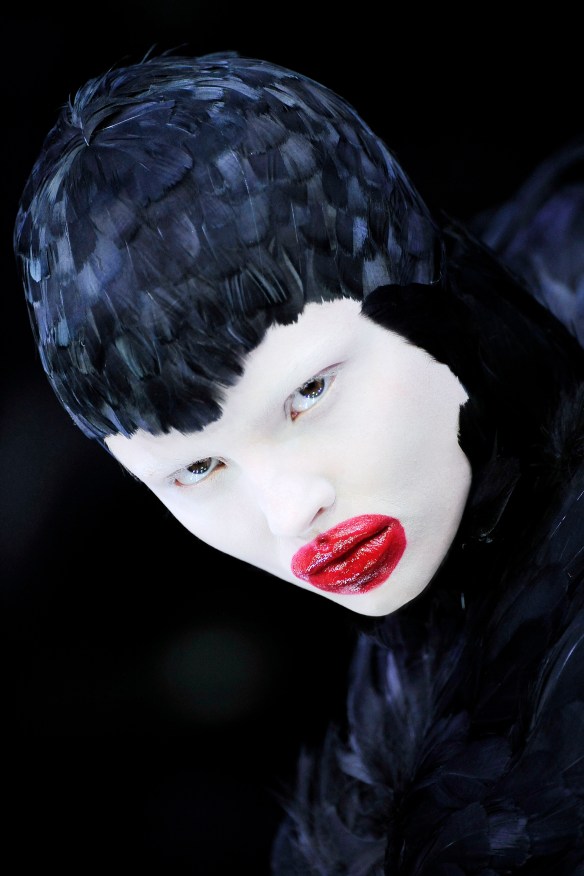
Alan Macdonald, Whims of Desire (2014, 44′ x 42′, Oil on Linen)

I had a long awakening dream-at the end there was a horse standing in a tree- a search party with dogs stood below and the dogs pled with the horse to come down from the tree, but the horse tried and failed, saying that he couldn’t as he was born in that tree -it was only later a friend said- that’s you. If you’re born to be an artist then that’s you in the tree.

Alan Macdonald.

What takes many artists a lifetime to learn is to be themselves and no one else; an imperative that takes courage, conviction and sheer determination in an Art World driven by artistic personas and shooting stars. Many artists produce what they think will bring them “success”, denying the authenticity and unique vision that actually creates a sell out show. Walking your own path and possessing the uncompromising willingness to go where the work and process dictate creates a special kind of energy in the making of Art. It is immediately palpable, sensed and felt directly by the audience regardless of the Age or discipline and the primary source of connection between the artist, the viewer and the work. What is immediately apparent on meeting Alan Macdonald in his studio is his profound focus and boundless enthusiasm, fully invested in creative process. Each new work is a puzzle to be solved, constantly striving towards greater awareness, fluency and distillation of language. What sets him apart in the world of Contemporary Art is his intense curiosity and joyful humour, testing his own limits as an artist and what the confines of a two dimensional painted surface can be. His latest body of work marks a significant milestone in the artist’s oeuvre, a level of mature integration of style, technique and unconscious obsessions which have consistently shaped his practice for over 30 years.

For Alan Macdonald Life/ Art is a serious, invigorating game of discovery, shared wholeheartedly with the viewer. The refreshing and expansive quality of his work lies in its joyous engagement with the imagination and free association. This openness in relation to self-awareness and to the world is invested with a childlike sense of wonder and possibility. “Each painting wants to be something; my job is to find what that is.” “I give [the viewer] the actors, the props and the set”, actively encouraging the audience to be their own Director and make their own connections with the work. Macdonald invites us into the playground of Art and into his paintings; to bring ourselves to them in a way that is liberating and free from cultural austerity. He encourages us to access the child within and to trust our adult selves enough to create our own meanings and narratives within and beyond the frame.

A Monk With a Skunk

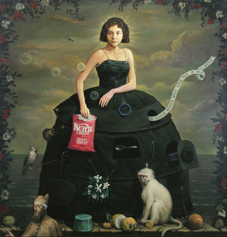
Alan Macdonald, A Monk With A Skunk (2014,Oil on Board, 18′ x 24′)

Although humour and beauty in the treatment of his subjects is often the initial hook, what keeps me returning to this artist’s work is the multi-layered nature of the exploration, plumbing the depths of our hidden selves. “Each protagonist has a purpose” and finds their own ways of stepping outside the picture plane. The primitive, instinctual, childlike aspects of ourselves appear in Macdonald’s work and process like Freud’s analogy of the Id as a horse, with “superior strength to that of the rider”.  The rider (The Ego) on horseback holds the impulsive horse in check, but must also acknowledge the spirit and strength of force (or state of being) which ultimately carries him/her forward. The integration of design, deliberation and instinct in this latest body of work acknowledges the importance of this creative dynamic. Letting go of the reigns may bring an artist temporary fear and uncertainty, but it is also a way for the maker and their audience to experience movement, growth and go further than the conscious mind would ever sanction.

Macdonald never begins his work with a final image in the mind as a foregone conclusion. His sketchbooks are as fluid as his approach to board, canvas or linen, a fertile ground for ideas to surface in drawings which are erased and revisited over time; creating a new moment when a combination of elements or something emerging out of the ground takes the work in a another direction.  An essential part of the creative process is engagement with underlying thoughts, feelings and motivations which may not be brought into conscious awareness until the composition or body of work is complete. Surprise and discovery are as much a part of creating the work as seeing it. Macdonald characteristically brings objects of modernity, memory and history into play with the human figure to create multiple pathways of interpretation across time. High Art, Contemporary Design, Theatre and Craft are equals in his compositions and framing. Although there are elements of the Surreal in his work; in the juxtaposition of elements and objects out of time and place, it is not Surrealist and resists such definitions.

“You’ve got to let it flow and catch up afterwards. It feels like your unconscious is the more intelligent side. I always have this inner dialogue- like its saying; ‘Oh for goodness sake!’ and the conscious side is going ‘wait, wait- I don’t understand!’ (Laughing) With opposites I’m thinking – can I get away with that and make it visually work within my language. The first Van Dyke figure on a Vespa was full of life, saying something so simply and directly. When you come to paint the bike and her- they have to work together and be in the same painting. If I paint the Vespa exactly, all gleaming and precise it will look like it isn’t meant to be there.  Magritte said it’s very easy to be a Surrealist by putting a lobster on a phone but it’s much more poetic to place an egg inside a birdcage. It’s coming up with something special that isn’t just quirky or obvious. I worry over paintings-I say to myself, is that right? But I really believe in taking a risk sometimes. Put restrictions on yourself and play with the boundaries, without restrictions there is chaos. If it gets predictable, throw in a spanner or a grenade!”

The-Candy-Man

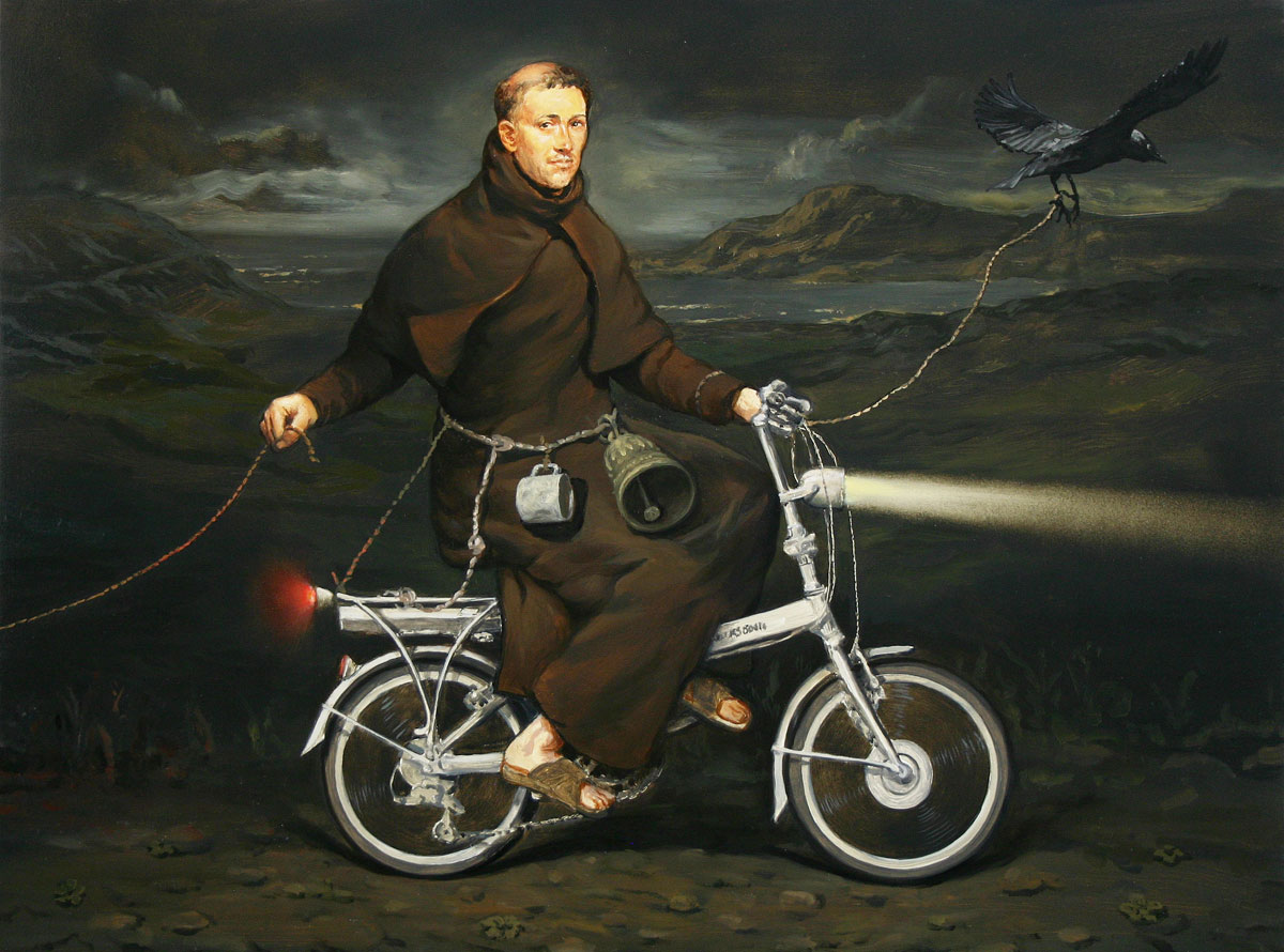
Alan Macdonald, The Candy Man, (2014, Oil on Linen, 75′ x 85′)

Understanding the categorisation and hierarchy of Western Painting and its canon of Masters, Macdonald visually acknowledges his artistic heroes like Titian, Ingres, Goya or Van Dyke but also throws a grenade, actively subverting our expectations of how the female nude, portrait, self-portrait, landscape or history painting should behave. The artist’s palette and glazed surface of his paintings, which ironically employ a technique used in restoration, create the depth and feeling of an Old Master, but with fresh marks that resist definition and encourage the viewer to complete the work.  The historic cloak of pigment and glaze, like the costumes and armoury worn by his figures are part of a visual inheritance, but they are also part of the eternally human game of trying to come to terms with Now; who we are, why we’re here and how we see ourselves. Humour is a key element in Macdonald’s work, together with a lifelong investment in his craft; always working to be present and receptive to the moment of inspiration when it comes.

“In the studio I’m playing but in an advanced way. I don’t believe in standing still. I keep learning ways to keep the painting fresh and painterly. My process has changed radically; I used to under paint bright colours and then paint it out with black and bring it back out. It’s like when you change a face- not in a photographic way but a painterly way, like you’ve just given it a soul. You have to keep an open mind- I come into the studio in the morning with a sense of adventure. I have to find a way to work quickly so I can capture that energy- if I plotted and planned for a week it just wouldn’t happen for me. I can plan a big painting then the morning I go to start it the Id will go’ hey (He whistles) over here!’ and I always go with that. If you’re a little bit scared of your ideas that’s healthy-if it’s not happening with a painting then take a risk…

I had some success with my abstract paintings- you make a mark and then respond to that mark in wild abandon- then I controlled it a bit more- using texture, primer to pre-prime an area- rub back through, using accidental marks and layers as leading elements. Abstraction taught me about following my feelings and not having to have a reason before you start. Some of my best works have happened because I don’t really know why, but I know that I want to.  The response was childlike- immediate and honest.  If you start painting about painting you need to get a life!  When I go into my studio I go inwards and see what I find on the journey. When go out to a film or read they naturally filter in and eventually they pop back out again- your subconscious picks and chooses what it wants. I’ll have this! I find that really exciting- you experience the world, be inquisitive, look into things. I love Brian Cox’s programmes- he can say something which is hard to get your head around and then he’ll do something with sand- while he’s saying it he’s got a smile and then he stops and he’s dead serious.”

Beyond-the-Pale

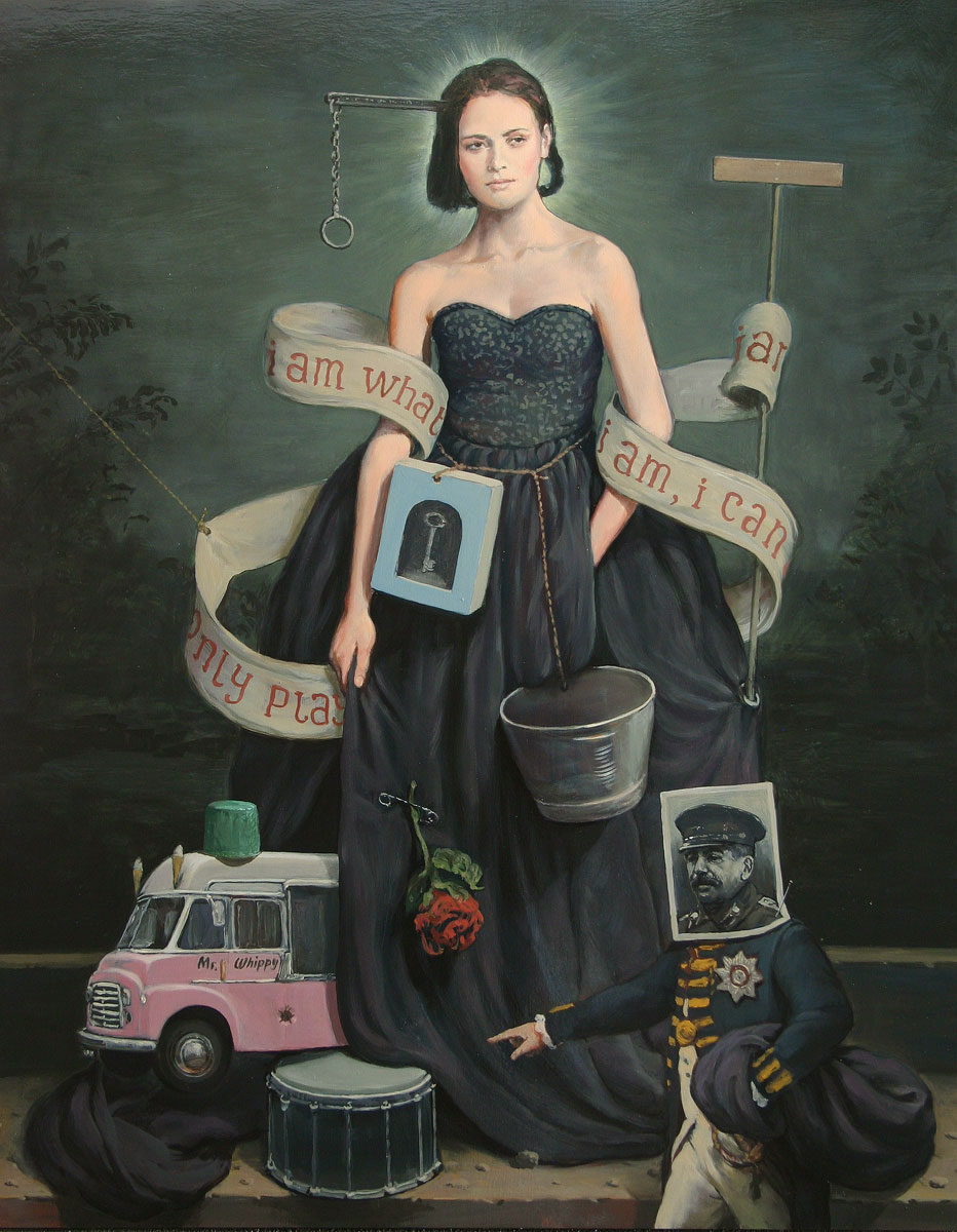
Alan Macdonald, Beyond The Pale (2014, Oil on Board, 13′ x 24′)

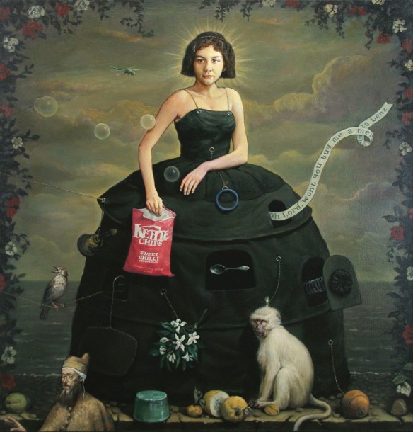
“Play like a child, but seriously” is a way of being shaped by the artist’s formative years in Malawi, South East Africa. Grounded in indigenous ways of seeing relationships between the natural world, spirituality and human perception, Macdonald’s vision as an artist is defined by natural fluency between the physical and metaphysical. Creating his own worlds through painting, aspects of self such as courage can emerge instinctually, often in animal form. There is a dance of integration between primitive, instinctual elements feeding the work and civilizing structures of domed confinement such as hooped dresses or architecture which also appear in his paintings. Macdonald’s work is created “beyond the pale” with a clear sense of a dominion of order and authority, knowing within himself that a much more exciting and fertile territory lies beyond.  The uncontrollable and the highly cultivated are marriage partners in his paintings, a relational balance of captivating tension seen throughout his work.

“I was very privileged in my upbringing”, he says, describing leaving Malawi for Scotland as a teenager as “the closing of a lovely bubble of my childhood.” Macdonald powerfully invokes this state of child-like reverie and adventure in his mature work. As a child growing up in Africa with no television and scarce access to consumer goods, immersion in imaginative play and the natural environment fired the artist’s burgeoning creativity. The freedom to disappear for the whole day to play with other children in the village, absorbed in games that became ever more inventive and complex, left a lasting imprint. “There was also the Majestic cinema- they did a Saturday kids screening- everyone was shouting and cheering, if there was a pirate film on you’d be fighting all the way home.” Visiting the UK on leave with his family every two years, everyday products, new cars, ice-cream vans and Pop music amazed and delighted him. “A light went on at 12 or 13 that didn’t go out”.  In Africa Macdonald was also introduced to the idea of Craft as the integrity and pride invested in handmade objects; in the unexpected beauty of recycled tin cars and woven materials, the sandblasted patina of old fashioned coke bottles and the pristine tailoring of hand sewn clothing which shaped the young artist’s conception of making.

“So much of what we buy now is machine made-but there is a need for man-made, tactile things- it’s why people buy antiques.  They can get a wonderfully straight surface but it’s not quite straight. I want my paintings to feel like they are handmade- there are mistakes if you look at a background or when I’ve changed my mind. Then on the other side I love modern things.  I know a lot of people don’t like Jeff Koons, but the first time I saw ‘Balloon Dog’ I thought it was fantastic- it has such a lust for life- It’s like a child jumping up and down saying ‘Look at me! I’m Happy, I’m Happy!’ I’m sure there is another side which is calculating, but I loved the piece he made for the Venice Biennale-the big puppy with its tongue hanging out made of flowers that eventually withered, it was stunning.”

Leaving Malawi on the cusp of adulthood, just as he was becoming aware of the societal boundaries that existed as part of the country’s colonial past, has kept the artist’s memories of childhood liberty alive.  It is this naiveté, sense of gratitude and joie de vivre that enter into the rendering of brightly coloured packaging or the natural cohabitation of human figures, animals and objects in Macdonald’s mature work. Reflecting on his passage from childhood to adulthood, the artist described seeing a more recent photograph of the family home in Malawi, surrounded by razor wire- a life and world view defined by “mistrust” he was fortunate to escape. What the young man carried with him to the UK was the vital spark of imagination (a quality which in adulthood is all too often driven underground) and the enduring conviction that an artist was the only thing he could possibly be.

Drawn to visual expression from an early age, in “dusty colonial libraries” he discovered books on Reynolds, Whistler and Da Vinci, free from the institutional framing of museum and gallery halls. In Da Vinci he saw not unattainable genius, but a growing capacity within himself; “Da Vinci analysed everything, he took it apart to really look into things deeply”. This quality can be seen in Macdonald’s adult paintings, applied to visual language and the compartmentalisation of dark reliquary spaces in works like Guru (1993) and Portrait of a Saint (1999). The dark grounds of his paintings are fields of unconscious retrieval and spaces of awakening conscience, carrying positive rather than negative associations. “When I was a child living in Africa, I was outside on a night lit by the moon and feeling a little scared, I stepped from the light into a dark shadow. The darkness wrapped itself around me and fear was replaced by an understanding that I was being protected.” 

03  Hell Hole

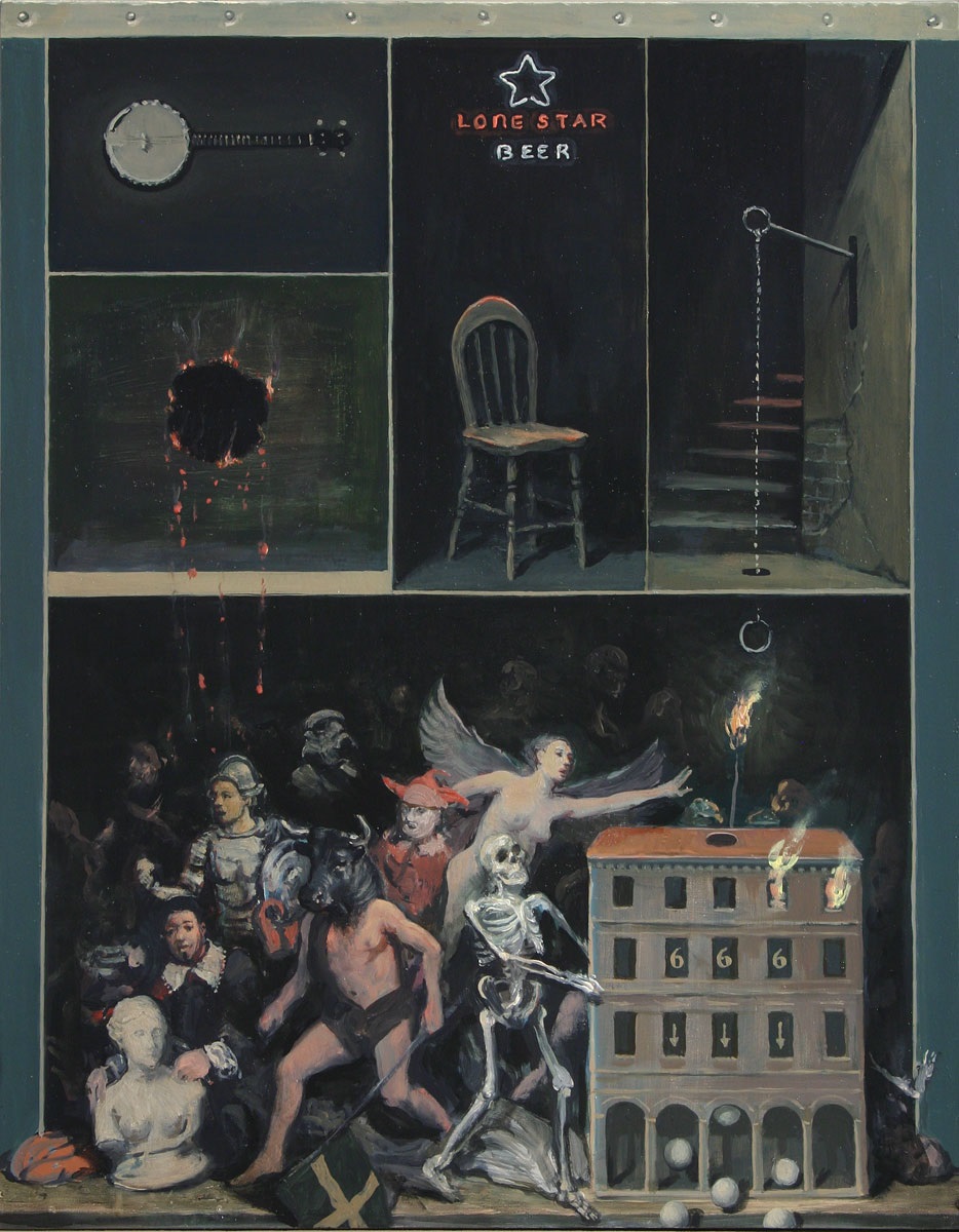
Alan MacDonald, Hell Hole.

04. Minotaur At Rest

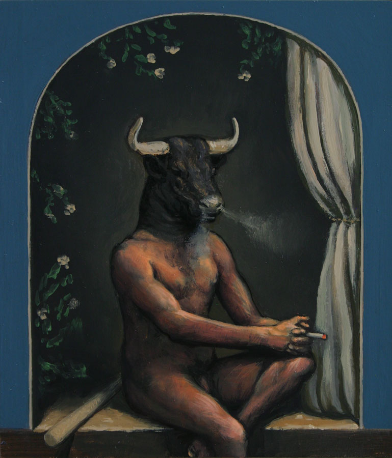
Alan MacDonald, Minotaur At Rest.

Recent works such as Hell Hole (2014, Oil on board 21″ x 16″) and Minotaur At Rest (2014, Oil on Board, 10″ x 9″) return to the idea of dark recesses of the labyrinthine mind and what can be brought forth in a Bosch-like stream of consciousness towards greater awareness. “After the Minotaur- I did this- a painting that I just stopped working on- (Hell Hole)- originally it was a woman with a dress, one figure came out- then another and another- they just took over. It’s a bit of an uncontrolled and unruly painting but there’s a lot in there…the nailed section at the top might come into the arches and make them more tactile.” Macdonald’s framing of imagery; using proscenium arches, split composition, theatrical curtains and mental shelves ,where protagonists or objects in the foreground are about to fall into the spectator’s own space, create an exciting sense of shifting perspective. Like the image of the disappearing staircase in Hell Hole, Macdonald’s paintings encourage us to explore the labyrinthine spaces within our own minds. The repetition of circular forms also appear as threshold spaces; the burnt hole revealing a dark ground beneath, the banjo rim, the dark emotional hole of the lone chair and neon sign, the lever and pull cord to the basement of marauding figures and the white balls tumbling forth from slot machine model architecture. The paint handling in the painting’s furthest recesses is Goya-like, bold marks which allow us to imagine a Hell Hole of our own making. Even within this darkness however, there is a torch-like match- aligned with an angel who reaches towards it. The burn hole leading to the dark space beneath the painting becomes a vital act of seeing.

02-Guardian-of-AngelsAlan Macdonald-Guardian of Angels.

This idea of the dark ground of ourselves is beautifully distilled in another recent painting, Guardian of Angels (2015, Oil on Board, 21″ x 18”). Here the bisection of the image seen through a stage-like archway serves as a self-reflexive space. The central male protagonist stands to the right, in a tonal recess that suggests movement between different fields of perception. There is incredible depth as you move around the painting, the glazed dark space behind the figure expanding beyond all expectation. Our sense of perspective is not created by the Renaissance style chequered floor or an idyllic Arcadian landscape but by a composition of elements which are endlessly fluid. The calm demeanour of the “guardian” in historic costume, with comic ruff, the sandals of a pilgrim, gun, bell and bugle stands guard at the window threshold to a landscape which is itself loaded with shadows of ambiguity. The red rose above him feels like steady devotion to his task, guarding the angel or spirit of exploration moving into a space within and beyond the picture plane. The cut stump in the foreground and empty hollow plinth of equal height seem to regard each other on a stage of interior projections.

Villain-of-the-Peace

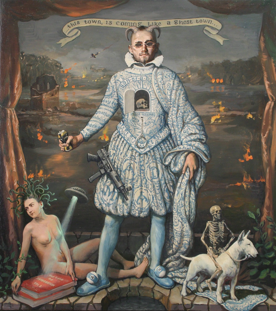
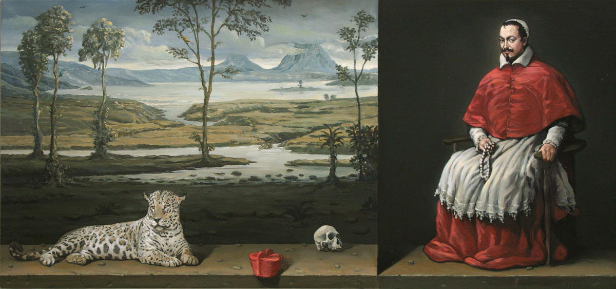
Villain of the Peace (2015, Oil on board 27″ x 24″) utilises a cutaway stone shelf beneath the horned male protagonist, a form mirrored in the cuckoo clock-like cavity in the centre of his chest, reflecting the interior foundation of the painting. Latin and modern text is incorporated into the ornate pattern of his Elizabethan costume which conceals as much as it reveals; a player with an action man type cord pull, AK47 at his hip and crushed can in hand in florid, theatrical dress. Standing above a well from which the assembled characters have come to drink, UFO beaming down on a Book of Retribution and background fires blazing, the central protagonist occupies shifting ground between comedy and destruction. Beneath the surface of the painting and the protagonist’s feet is the fluid, emotionally conductive element of water. The reassuring framing of stage like curtains contain the scene, but the wellspring at the base of the painting remains endlessly expansive. In A Simple Test of Faith (2014, Oil on Board, 17” x 36”) a male protagonist in cardinal’s dress sits in a space which creates its own shadow. The bisected composition with a landscape of historic exploration, attendant jaguar and Memento Mori skull is tensely balanced between humour and danger.  Macdonald playfully places the protagonist’s hat on the ledge of the painting and dares him to retrieve it. In the game of painting it’s isn’t a choice between Truth or Dare, but both simultaneously.

A-Simple-Test-of-Faith

Alan Macdonald, A Simple Test of Faith

Early paintings like Portrait of an Anarchist (1996, Oil on Board, 10’ x 32’) a panel of upside down images; Still Life, Portrait, a tree in the Landscape and vertical cloud/ horizon line. (Labelled 4, II, one, three beneath) actively play with expectations about genre and the snobbery of “knowing about Art”, a perception which is so often a barrier to honesty and enjoyment. Instinctively the audience, upon seeing what looks like a sequence of Old Masters, turned on their head with jumbled numerical hierarchies and script, understand the joke. The artist is definitely having fun, but there is also something going on beneath the entertaining punch line. Seeing an exhibition of work by Joseph Banks, Macdonald was inspired by the unexpected colour, expression and abstraction of dashed lines and connecting labels suspended in space. Rather than definitive labelling of diagrams, the scientific expedition and visual exploration of this living material presented an imaginative open book. Text often operates as a kind of inner recess or an abstract in Macdonald’s work, rather than labels which define or ascribe absolute meaning. Like the distillation of words in poetry which create natural spaces around lines and stanzas open to interpretation, the visual elements in MacDonald’s paintings are similarly composed.

The evolution of the artist’s work has been very much about letting visual elements out of their boxes of definition, categorisation and genre. When text is introduced into his paintings it is imaginative rather than instructive or didactic, seen in the emotive resonance of song lyrics or in Bird Brain (2010, Oil on Linen 70 x 60) as a stream of seemingly useless but associative information. “With Bird Brain it was so exciting-like what are you going to write? I found this wonderful miscellany- you can get the ingredients for a McDonald’s hamburger next to something completely different and it fires up your brain with opposites-just completely random things. It was free- It felt great to be able to put anything on a painting and still have it work as a composition.” This sense of freedom also extends to objects, imagery and variations of scale within a painting. “Like (panorama) photographs that don’t quite meet- the joins in the middle are exciting”, part of a shifting ground of perception, the artist consistently playing with pictorial boundaries.

Spaceman

Alan Macdonald, Spaceman

In a recent work like Spaceman (2014, 15’ x 16’, Oil on Board) there is no need for the artist to turn the painting upside down, gravity defying weightlessness has become an integral part of the artist’s language. The face who confronts us, starched white collar, ties and hair drifting in the timeless atmosphere of all human enquiry, is suitably enigmatic. His expression is like many of Macdonald’s protagonists, a subtle combination of emotions; of steadfast contemplation, an almost quizzical eyebrow and a burgeoning smile which we sense might break into laughter in the next moment. Surrounded by rubbery Haribo sweets, the egg in his hand is a comic twist at the heart of artistic creation. The depictions of consumer products in the artist’s paintings are comfortingly familiar but they are also intrinsically painterly. “When I’ve looked into a cartoon or packaging or just being in the supermarket- its striking colour and pictorial elements next to text- they’re like the Dutch ruffs, it’s so dramatic and offsets the flesh of the face…A can of coke is a complete leveller- it can be held by someone on the street or a film actress. Placing products is a levelling process, it is also the tension and dramatic effect of colour and texture; metal next to glass next to wood, they’re visually exciting- the writing as well, I find writing beautiful.  The Rebirth of Venus– Coca Cola sign behind her head- it has such an impact, brings the painting to life.”

The-Elders-Surprised-by-Susanna

Alan Macdonald, The Elders Surprised by Susannah.

One of the most fascinating aspects of Macdonald’s work is his depiction of the female figure as a uniquely self-possessed central protagonist, often deep in her own thoughts. The female nude in Art, traditionally defined by the male gaze, objectification and display is subverted by the strength of the Feminine in Macdonald’s paintings. Interestingly his female nudes often sell to women. His treatment of a popular biblical subject in the History of Western Art; Susannah and the Elders (painted by male artists for centuries including Rembrandt, Tintoretto, Van Dyck, Rubens and Picasso) is characteristically given a humorous twist. However Macdonald’s The Elders Surprised by Susannah (2009, Oil on Board, 19’ x 15’) also delivers a feminine force to be reckoned with.  She is not a woman passively unaware that she is being looked at or overcome by the threat of lecherous advances.  Often treatment of this subject places the viewer in the position of voyeur, but here we witness Susannah centre stage, emerging luminously from the dark ground, head turned, sights set on those spying on her beyond the picture plane.  The gun she holds is level with her head and equally illuminated- her bent knee and coyly curled toes a pivot for the idea that her poise isn’t to display her nakedness or to conceal her shame, but to take a better aim the next second and take out those who have disrespected her. Her hold on the gun and trigger suggests she’s shot it before and this idea is a counterfoil to her embodiment as a passive object of beauty and chaste morality. Instead of waiting for an ancient narrative in the form of Daniel to uncover the truth and rescue her, Macdonald’s Susannah reveals her own truth in a moment of discovery, being seen as present in her own body and mind. The image is strikingly contemporary, immediately humorous and intriguingly knowing.

Black-Betty

Alan Macdonald, Black Betty (2006, Oil on Linen, 45′ x 36′)

Macdonald visibly acknowledges “the female side of Creativity”, powerfully present in paintings such as his Black Betty series, Queen of the South, Divas Don’t Run, Honky Tonk Woman and A Dame With No Shame. The artist describes these feminine protagonists as elements of self “responsive to feeling”, “unafraid”, “unashamed”, courageous and challenging. “I often put firearms in –people can take them literally- but I mean for them to empower, like Honky Tonk Woman with a pistol on her dress, it just means don’t insult this woman and expect nothing to happen. The feminine side is strong in me- if I’m painting a figure that’s an inspiration she can be quite aloof. I feel inspiration is like that.  It’s like she’ll turn up and go ‘Alright, I’ll turn up just this once!’-‘Well thank you I’ve been sitting here for weeks and now you turn up?!’(laughing). She’s a bit begrudging but when she does show up its great.”

Like Jung’s idea of the shadow self (anima for the male and animus for the female, both with positive/ negative aspects and linked to the collective unconscious) the female protagonists who take centre stage in the artist’s paintings are active triggers for development and creative evolution. One of my most important paintings was Black Betty (2006) to officially come back to the darkness in my paintings- and she was the Goddess of dark paintings! She was standing there staring straight at me through her dark glasses! I did 3 or 4 Black Bettys just because I couldn’t paint anything else. She’s in here.” In more recent work like One Singer One Song (2015, Oil on Linen, 30″ x 24″) there is a feeling of expansion; the central female protagonist climbing onto the plinth, sweeping away a model architecture of being, ready for her unique voice to be heard and explored in future paintings.

01  One Singer One  Song

Alan Macdonald, One Singer One Song.

Macdonald’s persistently inquisitive nature, his humour, infectious enthusiasm and sheer bloody mindedness have resulted in a liberating distillation of language in this latest body of work.

“I do the work to understand, to work something out- if I can do it in an entertaining way that’s great. It’s about awareness. That’s the most important thing and feel I understand myself better. There is also the expression, the human aspect. Like borrowing from Muybridge’s woman up a ladder with buckets, that one frame, the moment where she puts the buckets down, her expression is like ‘for God’s sake!’(laughing) -that gets me.” Although MacDonald’s paintings are deeply personal, significantly his work rises above the merely self-referential. The humour and playfulness of his imagery isn’t the sum total of the work, after you’ve stopped laughing there is plenty of substance to be drawn into with each successive viewing. They are paintings meant to be lived with over lifetimes.

The-Garden-of-Knowledge

Alan Macdonald, The Garden of Knowledge.

Tipping its hat to Arcimboldo’s 16th Century heads made of flowers, fruit and vegetables, The Garden of Knowledge (2014, Oil on Board 24″ x 20″), depicts a portrait bust of a man sporting a cap made of flowers, who “still manages to maintain his dignity” and “has a little bit of knowledge to impart”. The white ruff he wears has been turned into a kind of pinball mechanism, white pearls of metaphorical wisdom hatched from his head, falling into the foreground and spilling into the viewer’s space. The colour of his costume mirrors the red breast of the robin to his left, suspended in flight. There is delicacy, vulnerability and poignancy in the presence of the bird and in the nuances of facial expression which meet the viewer’s gaze, shifting before our eyes as we go deeper into the painting and the emotional complexities and contradictions of what it is to be human.

The level of maturity, integration and engagement in Macdonald’s paintings is quite extraordinary, testament to an artist bringing all of his understanding, energy and passion to bear in his latest body of work and always striving to do better.

 “I’m very stubborn, I won’t give up. You can have the most terrible time some days but then I get up and start over again. There are always things that you need to improve but it’s also good to know the things that you’re good at. When I left Art School I knew I had a mountain to climb, that it is 99% hard work. I dug in for the long term.  I cut away all the rope bridges, I was offered teaching at different colleges but didn’t take any.  When things are really tough it makes you confront yourself, there’s a cliff edge back there and I need to get better. You say to yourself, I can’t compromise what I do but I can get better at what I do. I’ve learnt to say I can’t do that, but I can do this… and bring people on board. When I finish a body of work 2 or 3 really stick out above the rest and they always sell because people detect that so I thought –what would happen if you got a higher percentage up to that level and beyond? I just dug in and after a while you think-wow I couldn’t have done that last year and it then gets very exciting, because all these doors are flying open and that’s what keeps me going-the paintings I haven’t done that I want to do… the difficult ones are important because they allow you to move forward- wanting to get technically better and better and getting deeper intellectually into the process- starting to recognise things much sooner. Like David Sylvester saying to Francis Bacon; ‘You used to destroy a lot of your early work but you don’t so much anymore’- it was a thorny question, he was challenging him and Francis Bacon said; (narrowing his eyes and imitating Bacon’s distinctive voice) ‘I like to think I’m getting better!’ (laughing). He always said the right thing! I feel the same, as you get older you get better – but there’s also a side of me that pushes too hard. Years later you can push further and make the thing work.

Paint what you want to paint- don’t compromise, it’s that simple….Go back to where you were as a child. On a bad day all the demons get on board and doubt sets in- you think you were wrong. So I say to myself when you had no art education or anything else what did you really want to do? There’s your answer.”

www.alanmacdonald.net

All images reproduced by kind permission of the artist.

Alan Macdonald is currently exhibiting at REALITY: Modern and Contemporary British Painting. Sainsbury Centre for the Arts, Norwich until 1st March 2015.

The Royal Scottish Academy Annual Exhibition, The Mound, Edinburgh, May-June 2015.

and Kilmorack Gallery, By Beauly, Inverness-shire. 19th June- 1st August 2015.

Silence is a Virtue- The Artist

Ahead of Inverness Film Fans (InFiFa) Modern Monochrome Season screening at Eden Court Cinema in February/ March 2015 I revisited Michel Hazanavicius’ multi award winning film The Artist.

The artist 1

The first time I saw The Artist it instantly became one of my favourite films. I’ve watched it many times since both in the cinema and on DVD and it never fails to lift my spirits. I have always believed that when an artist of any discipline is fully invested in their work, the audience will feel that energy and connect with it. In the Visual Arts this communication is predominantly silent and although mainstream cinema makes us forget, telling the audience the story through dialogue, Film is at its heart a visual medium. Its power lies in the audience’s felt sense of the unspoken narrative within the frame. All great Artists/ Directors regardless of the age understand this as an intuitive part of their creative vision. Perhaps what struck audiences and critics between the eyes with The Artist on its release was a language or visual literacy we intuitively know as human beings, but that mainstream TV, Advertising, Gaming and Studio Film product largely fail to awaken within us. There is a division in Cinema, mostly in the heads of film financiers, producers and studios, between Mainstream Film and Art House; a belief that you either have to make something “entertaining” for the masses, appealing to the lowest common denominator in order to generate as much profit as possible, or something “intellectual” and aesthetically driven that relatively few people will see and even fewer will appreciate. The Artist explodes this myth in its making and its global reception by both audiences and critics.

The success of The Artist doesn’t just lie in over 150 international film awards it has won including those at Cannes, the Golden Globes, BAFTAS and Academy Awards, or in its box office takings. Almost single handed it has been responsible for a resurgence of public interest in Silent Film. Following its award season success in 2012 LOVEFiLM, Europe’s largest subscription service, streaming films over the internet and sending DVDs by post, showed that “viewing of the 66 films in its Silent Film Collection significantly increased with as much as a 300 percent increase on some individual titles. Of the ten movies in LOVEFiLM’s collection that enjoyed the highest growth, four starred Buston Keaton- one of the greatest silent movie actor-directors of all time.”[1] From Roaring Twenties chic Fashion Design to DVD rentals and the growth of Silent Film screenings with live accompaniment, The Artist has raised awareness about a tradition of seeing the rise of digital technology had almost made us forget. It isn’t about nostalgia for an era of cinema long past, but a living Art, tapping into a wellspring of pure visual storytelling.

The late great American Film Critic Roger Ebert wrote;

“Is it possible to forget that ‘The Artist’ is a silent film in black and white, and simply focus on it as a movie? No? That’s what people seem to zero in on. They cannot imagine themselves seeing such a thing. I’ve seen ‘The Artist’ three times, and each time it was applauded, perhaps because the audience was surprised at itself for liking it so much…” [It speaks] “to all ages in a universal language. Silent films can weave a unique enchantment. During a good one, I fall into a reverie, an encompassing absorption that drops me out of time. I also love black and white, which some people assume they don’t like. For me, it’s more stylized and less realistic than color, more dreamlike, more concerned with essences than details.”[2]

That sense of “reverie” and “enchantment”, the feeling of “dropping out of time” that Ebert describes is the essence of visual storytelling. We imaginatively project ourselves into the flickering illumination between each frame and The Artist consciously invokes that experience being shot at 22 frames per second. Before The Artist many considered Silent Film an obsolete Art Form; however the ability of filmmakers to silently communicate narrative is the foundation of cinema, originating in ancient shadow play on cave walls. Our need to make sense of ourselves and the world around us in visual terms is timelessly necessary and why we need Art in the first place. I first discovered the world of Silent Film in my childhood pouring over stills in my Father’s movie books. What immediately struck me, even aged 10, was the heightened clarity of black and white, the faces of actors and actresses alive with human expression, every tantalising image with a story to tell. That sense of wonder and immersion has never left me; it’s what I hope for every time I go to the cinema and what I found in The Artist the first time I saw it.

It’s true that it’s a charming and highly entertaining film, a winning combination of Comedy, Drama, Romance and a performing dog, but more significant (for me at least) is the Artist/ Director’s intention. Above all else it is a film crafted with love- a film it was thought nobody would want to watch. By the Director’s own admission, The Artist is a love letter to his wife and leading lady Bérénice Bejo and to a Golden Age of Hollywood founded on European artistry. For me it is a film resoundingly about the Art of filmmaking and what it is to be an Artist. There is love invested in every frame, in the meticulous crafting and sensuous attention to detail of Director Michel Hazanavcius’ entire creative team. It is seen and felt in the rich textures and tonal qualities of Mark Bridges’ costume design, the emotional layers of Ludovic Bource’s original musical score, in the extraordinary cinematography of Guillaume Schiffman and  the beautifully nuanced performances of actors; Jean Dujardin, as suave, charismatic antihero George Valentin, Bérénice Bejo as the young, effervescent rising star Peppy Miller, James Cromwell  as Valentin’s loyal chauffeur Clifton and Penelope Ann Miller as Doris, Valentin’s long suffering wife.

The artist 4

Modelled on Douglas Fairbanks Dujardin’s George Valentin is both masked, swashbuckling super star and fallible human being, marked by his own pride. Dujardin is an intensely physical actor who conveys all of George’s confidence, bravado and vulnerabilities, like Keaton and Chaplin before him. One of the most beautiful and immersive sequences in the film is a series of five takes where we see Valentin fall in love with studio extra Miller set to Bource’s theme music “Peppy’s Waltz”. We see the character evolve from playing his dashing on screen persona with intensely focused Silent eyebrow acting to the immense subtlety of expression which mirrors his awakening love for Miller. In cinematic and emotional terms it is a seamless fusion of historic and contemporary sensibilities.

In Dujardin’s acting and Bource’s music there is growing consciousness, bewilderment, intoxication and desire, evaporating quizzically in the moment. It’s an emotionally complex scene, a far cry from a clichéd swooning embrace or consummate screen kiss, which in The Artist we never see. Its Romanticism lies in creative possibility, expressed rapturously in the final dance sequence as the real beginning of the relationship between Valentin and Miller. Although this scene signifies the end of Silent Film it remains optimistic in tone, recalling the joy and glamour of big 1930’s Hollywood production dance numbers. The visual storytelling allows us to imagine a bright future as our two stars reinvent themselves; Valentin grounded in his craft from his days in Vaudeville and Miller the “It” girl of the moment with boundless energy, enthusiasm and good natured ambition. Miller’s rise as America’s Sweetheart, Valentin’s fall and their reinvention are a wry comment on the nature of fame in a media dominated age; “Out with the old, in with the new-make way for the young- that’s life!” declares a Miller in an interview with two eager newshounds.

The Artist isn’t just a homage or clever imitation of Silent Era moviemaking but a film very much of Now in its reinvention of the genre. I love the way it visually tips its hat to all the artists of European origin who created Hollywood’s Golden Age. Hazanavcius’ vision is informed by his understanding of the visual grammar of Silent Directors like Lang, Murnau, Vidor and Chaplin, but he is also very much his own man. The Artist was conceived visually and storyboarded in intricate detail by its Director, who went to Art School before working in advertising and then progressing to feature film. When long-time collaborator Ludovic Bource came to compose the music, although he listened extensively to the work of film composers of the era; Steiner, Hermann, Korngold and Waxman, what he achieves isn’t an imitation of those film composers, but a new voice grounded in their source material from Strauss to Stravinsky. The subtlety of the five take sequence is achieved because, as Hazanavcius has described in interview; “The script is the right hand and the music is the left.” Interestingly there have been screenings all over the world of The Artist since its initial release accompanied by a full orchestra, an aspect of live performance that was common during the Silent Era. Wonderfully this is becoming more commonplace at contemporary screenings and festivals worldwide as audiences rediscover the excitement of pure visual storytelling with the immediacy of live music.

At the end of The Artist George Valentin reveals his French accent and it is a telling moment on multiple levels. The advent of the Talkies extinguished the careers of many actors from abroad and behind the scenes advancement was often hindered by being an immigrant. As a Hollywood outsider, Hazanavicius takes the visual language of Tinseltown’s Golden Age and entirely makes it his own. It is ironic that Hollywood has accepted the film with open arms, most notably at the Oscars, perhaps not realising that its own visual inheritance is actually European in origin and that Hazanavcius is in fact reclaiming his cultural roots. In The Artist he takes us back to the early years of Hollywood with its origins in European cinema as a baseline of authenticity. Hazanavicius isn’t saluting the American Dream Factory in empty admiration but taking back language. He’s a visually literate Director and the fact that the film’s most dramatic moment is entirely silent speaks volumes.

The artist 2

The Artist is a film made with love, respect and recognition of the Silent Era and the artists who defined it. Rapid technological change is upon the industry as a whole and the digitalisation of cinema puts us in danger of forgetting the history and crafting of moving images to our collective detriment. The Artist asserts the importance of acknowledging that (in the words of the late Scottish composer Martyn Bennett) “to be pioneers we first have to acknowledge that we are heirs”. The visual grammar referenced by The Artist is also a rallying point for film conservation and restoration. Of the films that we know of produced during the Silent Era it is estimated that 80% have already been lost. The Artist is the story of the rise of young starlet Peppy Miller, the “fresh meat” of a new age of moviemaking and the fall of aging Silent star George Valentin, who cannot accept the technological change sweeping the industry he helped to create. It isn’t hard to draw a parallel between this and the transition from film to digital in contemporary Cinema.

It is perhaps for this reason that for me the most moving image in the film is the moment when Valentin is standing in the ruins of his apartment; the windows are smashed and the room has been ravaged by fire, the only movement is a slight breeze coming through the window, the light muted but illuminating- it feels very much like a fragment of very early film. He is literally and metaphorically standing in the celluloid ashes of his career. Everything seems hopeless and the grain of the image suggests that like nitrate, the film could burst into flames any second and be extinguished- much like the life of the central character. In that moment the personal becomes the universal, the mark of a true Artist/ Director and in a single frame it says everything about the vulnerability of film as a medium. The texture of the image reminded me very much of the work of photographers like Steichen and Stieglitz who in the early days of photography were a bridge between painting and the new technology. At the time photography was thought to herald the death of painting. Similarly many have proclaimed the death of film in recent years. The Artist is a film about film making in a time of great change and upheaval- that is what elevates it above and beyond mere entertainment. It speaks powerfully and resoundingly of Now and of the choices made by both Artists and audiences. In years to come it will become source material of our age.

The Artist 3

What I love about this film is the breath taking eloquence of its visual communication; the fanciful mime of the empty suit, the Surrealist cloud screen and dancing legs, the studio staircase sequence where Schiffman balances tone, movement and architecture in a composition that feels like pure music, the shadows of rain that fall down George’s face as he’s inwardly crying, George’s heightened dream sequence infiltrated by sound, his confrontation with his own shadow self and his world reduced to a pile of burning celluloid. I love The Artist it for its intelligence, humour and unashamed Romance, for the exquisite camerawork and its impeccable performances. I love that it has a brain and a heart- it makes me think, laugh and cry. But above all it makes me value those Artists who are told their film is one that nobody will want to watch, but toil to make it anyway  and change the way we see as a result. It’s the reason I feel renewed and invigorated every time I watch it.

Inverness Film Fans (InFiFa) Modern Monochrome Season

The Artist Wednesday 25th February 7.15pm

Ed Wood – Tuesday 10th March at 7.15pm

The Man Who Wasn’t ThereTuesday 24th March at 7.15pm

All films will be followed by a post-screening discussion, all welcome.

www.invernessfilmfans.org

www.eden-court.co.uk

[1]  6th March 2012, www.Film-News.co.uk

[2] Roger Ebert, The Artist, December 21, 2011.  www.rogerebert.com

Kilmorack Winter Exhibition

29 November 2014 – March 2015

Kilmorack Gallery, By Beauly

Summit-Fever

James Newton Adams,Summit Fever

Kilmorack’s Winter Exhibition features some exciting work by established artists and those new to the gallery including; James Newton Adams, Paul Bloomer, Patricia Cain,Sam Cartman, Kirstie Cohen, Peter Davis, Helen Denerley, Henry Fraser, Leonie Gibbs, Gail Harvey, Liz Knox, Allan MacDonald, Charles MacQueen, Illona Morrice, Robert Powell and Peter White.

It’s always a pleasure to see work by Shetland based artist Paul Bloomer, particularly his larger scale paintings and woodcuts. View From My Reawick Studio (Woodcut, 65 x 77cm, 1 of 20) with its heightened Expressionistic perspective leads the eye into the composition along a curve of wire to a progression of electricity poles and a tiny cottage in the distance. A squall of marks in which sky, sea and wind are bound together in an undeniable upsurge of energy inform human scale in the image. The angular bisection of the composition creates a psychological edge in stark black and white, with the human dwelling perched precariously on a downward slope of ground. Two curlews drift above the turbulence in ascension, while another sits stationary on the pole in the foreground; at home in their environment, pitched against the gouged physicality of sky.

Paul Bloomer,View From My Reawick Studio

Bloomer’s large scale woodcuts are the perfect combination of immediacy and deliberation; the spontaneity and intensity of the drawn mark in brilliant counterpoint with highly skilled formal design. Drawing and painting out of doors in all weathers, at the mercy of nature in the UK’s most Northerly Isles gives Bloomer’s work a unique dynamism and perspective on humanity. Charcoal drawing onto board provides the foundation for his consummate skill as a printmaker. Woodcuts demand an assured hand and mindful, hewn precision in their making, qualities which have always been present in this artist’s work; from the powerful social critiques of his Black Country figurative works to his current focus on the natural world.

Gannets-at-Noss

Paul Bloomer Gannets at Noss

His depictions of birds, particularly those in flight such as Gannets at Noss (Woodcut, 95 x 64cm, 1 of 20) or resting Yellow Warblers (Woodcut, 1 of 20, 50 x 64cm) are invested with life and light. In the former we see the aerodynamic velocity of gannets plummeting into the ocean, their design in perfect harmony with their natural drive to feed. The spiral like composition of Yellow Warblers exudes luminosity and natural order, the cyclical nature of life and vulnerability in bold silhouette. These are medium sized works compared to the expansive scope of Bloomer’s Art in Oils, Watercolour, Mixed Media and Printmaking; however their distinctive style and execution make them among the most striking works in the exhibition.

Watchhouse-Loch,-Watercolour-2011-(470x680mm)-Peter-Davis

Peter Davis Watch House Loch

Another Shetland based artist Peter Davis demonstrates his adeptness with watercolour, creating contemplative images with enviable economy. In Watch House Loch (Watercolour, 47 x 68cm) a basin like field of washes bled into progressive depths of ultramarine create a sense of emotional depth. The stillness of sky, water and reflective cloud in Davis’s lyrical image Smalla Waters at Dusk (Watercolour, 47 x 68cm) is a highlight in a suite of paintings by the artist which extend into abstraction. The most convincing of these are bridges between representation and abstraction, where the artist’s command of the medium is finely balanced in calculated fluidity. The suspension of pigment gives these works delicacy, revealing distinct qualities of light found only in the far Northern landscape.

a-dense-accumulation

Allan MacDonald,   A Dense Accumulation

Allan MacDonald has contributed some truly celebratory works to the exhibition. A Dense Accumulation (Oil on Board, 50 x 60cm) is a work of beauty with life in every mark. It’s a joyful celebration of nature in full bloom reaching towards an affirmation of blue sky. This quality is also present in Storm Cloud, Wheatfield, Oil on Board 25 x 30cm) where a thick impasto field is aglow and the threat of storm clouds are subtly contrasted with the brightness of blue above. The paint handling is fully invested in the subject, reinterpreting the landscape and our place within it. Sound of Many Waters (Oil on Board, 17 x 61cm) is another beautifully realised marriage of colour, texture and gestural mark; the rough edges of the board complementing the yellow of unfurling waves, deep oceanic greens and steadfast purple headland. Calm water, tide and ocean swell meet in a single evasive moment captured by MacDonald’s intuitive response to his environment and masterly paint handling.

Charles MacQueen’s work celebrates intense associations of colour, form and place. Pool Essaouira ( Mixed Media, 71 x 73cm) is a symphony of blue where overlapping fields of colour create depth in a supremely balanced composition of form and feeling. Heat Marrakech (Mixed Media, 102 x 76cm) is a furnace of orange and red, while Heat (Mixed Media, 70 x 60cm) contrasts the cool interior arch of the doorway with the glow of incandescent cadmium red. We rest in a space between shadow and light in MacQueen’s evocation of place and memory.

obje-trouv-for-edin

Liz Knox, Object Troves

A new addition to the gallery’s established artists is Liz Knox, whose best oil paintings are an intuitive rather than literal interpretation of the Northern Scottish coastline. Although the high octane palette sits on a formulaic edge, her nuanced paint handling is extremely sensitive and demonstrates great promise. Object Troves (Oil on Canvas, 71 x 102cm) is a good example, with the under painting emerging from shifting sands and receding tide. Within this fluid environment we see reliquaries of memory; gathered shells, a shoe and a bucket and spade presented in precious alcoves of sand and remembrance.

Near-Rispond-Sutherland

Liz Knox, Near Rispond, Sutherland

Near Rispond, Sutherland (Oil on Canvas, 71 x 102cm.) with its expanse of beach, depth of colour and emergent light on the horizon also presents an interpretative space rather than a pictorial scene. The rocks in the foreground feel like a mountainous microcosm of Sutherland, heightened by wedged accents of brilliant red. The curvature of a tide like stain in the lower right hand corner reveals the ebb and flow of the artist’s own rhythm and way of seeing; a distinctive voice which becomes somewhat lost in a work like Helmsdale Masts where the handling and palette are too uniform. What separates and elevates exponents of landscape painting in the UK is the artist’s ability to mindfully inhabit the landscape rather than simply look at it. Whatever the style may be if the artist is invested in such a way then inevitably the audience will feel it.

The-Milk-Round---76x76cm

James Newton Adams, The Milk Round

In Summit Fever James Newton Adams’ Summit Fever (Acrylic on Board, 76 x 76cm) the frozen ground is flattened into a promontory that extends into the icy blue sea beyond. With an economy of mark the artist portrays the human state of activity in each tiny figure, a quality which extends to a rare interior scene Highland Wedding (Acrylic on Card, 76 x 101cm). There is humour and pathos as we enter the austere expanse of a hall populated with tiny figures at a wedding reception, each one expressive of their own inner state. The naïve style is immediate and the perspective emotive. The Milk Round (Acrylic on Card, 76 x 76cm) is another fine example where the winding street of a seaside village dwarfs the lone figure bent double like the warning of an “aged” street sign, carrying home a dead weight of loneliness in a bag of shopping. The isolation of the human being is present in all of these works, but there is also life and humour in the artist’s keen observation. Although reminiscent of Lowry, these latest works are very much branded by Adams’ unique vision of humanity and the psychological territory of Northern Scotland. Until the daffodils begin to appear Kilmorack is a great place to fill the winter months with colour, light and insight.

All images by kind permission of Kilmorack Gallery.

www.kilmorackgallery.co.uk

Egon Schiele: The Radical Nude

The Courtauld Gallery, London. 23 October 2014- 18 January 2015.

EG1

Featuring some of the “most radical and unflinching depictions of the naked human form in modern times” this current exhibition of thirty eight drawings and watercolours by Egon Schiele at the Courtauld Gallery is a fascinating, explicit and contentious show.

Turn of the century Vienna was an epicenter of societal collapse and cultural rebirth; the city of Gustav Mahler, Arnold Schoenberg, Sigmund Freud, Carl Jung, Gustav Klimt, Koloman Moser and Joseph Hoffman. New languages; musical, visual, architectural and psychoanalytical were being developed in a climate of traditional world order conservatism colliding with revolutionary Modernist ideas. Human sexuality, desire and morality were being examined as never before. Instinctual, unconscious drives as the central motivation for human behavior and as a wellspring of creativity demanded a new framework of philosophy, morality and aesthetics. The young artist Egon Schiele actively sought out his mentor Gustav Klimt, a founding member of the Vienna Secessionists and from 1910 began to develop his own response to this milieu.  Radical times provoked radical Art; for Schiele a new language of the human body that is no less challenging and confrontational today.

Although we like to tell ourselves that there are no taboos left to be broken in the contemporary world and that freedom of expression is a cornerstone of Western democracy, the prolific growth of the Dark Net as a repository of desire and fear in our technological age would seem to suggest otherwise. Moving around the exhibition I was conscious of the reverential space of the gallery and a certain lack of context around Schiele’s images.  That Egon Schiele was a gifted artist and draughtsman is indisputable, however his work casts up a host of ethical questions, not least of which is his depiction of underage female models and the doll-like passivity seen in many of his images of women. If he were alive today he’d be the subject of screaming tabloid headlines and now as in 1912, when he was arrested and served a two month sentence for “contravening public decency”, the man and his art would no doubt be attracting scrutiny from the authorities. There were times when viewing this exhibition that I started to question the artist’s justification for his work:

I still believe that the greatest painters painted the figure…I paint the light that emanates from all bodies. Erotic works of art are also sacred. Egon Schiele, 1911.

What is so fascinating about this exhibition is the way that it confronts the viewer head on with their own beliefs and assumptions about Art, the role of the artist, gender, sexuality, maternity, death and desire. Schiele’s drawings and watercolours of male and female models, including self-portraits, are beautiful and disturbing in equal measure.  Often explicitly raw, sitting on an uncomfortable edge between eroticism, Art and pornography, they also provide valuable insight into the human condition; our fears, desires and vulnerabilities.

Male Nude (1909, Watercolour, ink, pencil) presents the viewer with the back view of a male body concentrated on the torso turned away from the viewer, the face entirely hidden in a dark, flattened recess of the picture plane. The sitter’s hand is positioned over his shoulder as if cradling himself. It is an anti-heroic image of masculinity and humanity, a young but ravaged body, intensely vulnerable;  the antithesis of muscular, beauty seen  in the sculptures of Ancient Greece and defining ideal human form throughout the History of Western Art. Made in the year he dropped out of Vienna’s Academy of Fine Art Schiele visually smashes the plaster casts of antiquity, turning his back on the traditional framework of reference for the nude in Western Art and embracing the Zeitgeist of Fin de siècle Vienna.

Reclining Male Nude (1910, Watercolour and charcoal) presents the figure pushed to the top of the composition, cropped and perched aloft in negative space. As in many of these early works the choice of palette is expressive rather than naturalistic; the model’s flanks in orange and green, his feet defined in blue and purple. The placement of the figure, together with use of colour creates a psychological edge to the image and a pervading atmosphere of unease. Male Nude With Legs Spread, Back View (1910, Gouache, watercolour, pencil) pares the body down to raw flesh and visible vertebrae pushed through the skin, our attention drawn to the stark mortality of bare bone. In Male Nude (1910, Watercolour and charcoal) the green/grey emaciated body on flesh coloured ground is severe and impersonal, face cropped, extending the study beyond the individual to the fragility of all human life.

This idea is also explored in Sick Girl (1910, gouache and black chalk) a subject that extends back to Medieval Dance of Death images and the recurrent theme of Death and the Maiden in Austro-Germanic Art. The actual figure of Death is absent, however the expression in the child’s eyes, wells of all consuming blackness, leave the viewer in no doubt that she is waiting for death. Her naked body is reduced to lines that articulate the tension held in her angular shoulders, her hands raised expectantly over her mouth. It is a particularly disturbing image due to the way that Schiele adorns her pubic area with a halo of heightened white. Her nakedness immediately suggests innocence without this mark. The inference is that Death as the ultimate and final human experience is about to take her ,destroying life and innocence. The Norwegian Symbolist Edvard Munch who was a great influence on German Expressionism also explored the subject of the Sick Child, together with the psychological state of puberty and its attendant anxieties. Schiele’s Sick Girl hovers uneasily between innocence and experience, disease and death.

Schiele’s Mother and Child (Woman with Homunculus) (1910, Gouache, watercolour and pencil) is a highly ambiguous exploration of maternity and desire which subverts the traditional subject of Madonna and Child. The female figure is turned away from the viewer, her rump exposed, a  sideways glance to the client, black stockings and a crimson nipple suggestive of her trade. The child is twisted behind her back turning towards her as she is turning away, her attention focused on the male gaze beholding her. “Homunculus” meaning “small human being” or “little man” could apply to the child she is physically rejecting or ironically to the “little man” she perceives looking at her. Her gaze like the display of her body is both seductive and calculated. She is, over and above any maternal instinct, depicted as a sexual being.

Nude Pregnant Reclining Woman (1910, Gouache and black chalk) is another fascinating image of maternity and gender. Dr Erwin Von Graff a gynecologist at the Vienna University Women’s clinic granted permission for Schiele to draw pregnant women and newborns at the hospital. Here the artist depicts a heavily pregnant woman, legs parted, her coloration of her skin painted raw and her face a featureless mask as if her entire identity has been subsumed by the growth inside her belly. The positioning of the pregnant female body is unexpectedly exposed and intimately claustrophobic.

Schiele consistently challenged societal norms throughout his work. Seated Female Nude with Raised Arm (Gertrude Schiele) (1910, gouache, watercolour and black crayon) depicts the artist’s sister, her face shielded and turned away, torso exposed; a study of female form, every line beautifully poised in hues of green, pink and blue.  His portrait Sneering Woman (Gertrude Schiele) (1910, Gouache, watercolour and charcoal, white heightening) presents an image of sociability inverted by the hostility of his sister’s expression. The large fashionable hat that would have been worn in public is at odds with the intimacy of her bare breasts and body language; arms folded as a barrier, lips pursed and eyes narrowed to an aggressive sneer.

Squatting Female Nude (1910, Gouache, black chalk, white heightening) reduces the female body to a head and limbless torso reminiscent of ancient Venus figures, but with hands twisted uncomfortably behind the back and rouged nipples grounding the body as an earthly object of desire. Standing Nude in Red Jacket (1913, Gouache, watercolour and pencil) extends the erotic charge of colour further with the limbless torso framed by an open red jacket, red nipples and genitals. The economy of line in this drawing is extraordinary, however it is a beautiful sum of erogenous parts rather than a whole body, a self-possessed individual or an attempt to explore the complexities of female sexuality.

d1ccd554-c028-450a-bd39-b4f4ec365c9e-275x420 Woman with Black Stockings (1913)

Shiele’s portrait of his lover Wally Neuzil Woman with Black Stockings (1913, Gouache, watercolour and pencil) in spite of having freed limbs is no less passive, the model raising her skirt, lifeless and doll-like. Although this is a supremely balanced and highly skilled drawing, there is no vitality or erotic sense of the sacred present. None of Schiele’s self-justifying “light” emanates from her body. However well executed, it is merely an emotionally vacant image of a woman in sexual servitude of male desire.

Standing nude with stockingsStanding Nude with Stockings (1914)

In contrast Standing Nude with Stockings (1914, Gouache and black crayon) places the female figure at the centre of the composition; hand on her thigh, poised, angular and assured rather than submissively posed. Schiele’s lines are muscular and supremely elegant, displaying incredible fluency of draftsmanship and arguably a greater degree of equality between female model, male artist and the viewer. Another 1914 work Side View of a Semi –Nude  (Watercolour and pencil) displays a more monumental and semi abstract treatment of the body, the folds of fabric ,model’s exposed flesh and the curvature of her stockings rendered with care and precision. Like the adjacent work Friends (1914 Pencil and gouache) where the bodies of two women are melded together in a structural framework of lines Schiele achieves an enviably balanced composition. The two female figures command three quarters of the picture plane, without the psychological imbalance of being shoved into a high corner or severely cropped.

untitled

Kneeling Nude with Raised Hand (1910)

The effect of the whole exhibition is much like Schiele’s Kneeling Nude With Raised Hand (Self Portrait) (1910, Black chalk and gouache) where the gaze is turned upon the self and the artist steps directly into the viewer’s foreground, hand raised to stop us in our tracks, his semi abstracted body in red, green and orange sensitively bleak and timelessly confrontational. Between 1910 and his death at the age of 28 from the 1918 Spanish Influenza pandemic Schiele created an intense and uncompromising body of work.  This first major UK museum exhibition devoted to his work for over twenty years and the ethical questions it raises about the role and responsibility of the artist, gender and sexuality are still strikingly relevant.

www.courtauld.ac.uk

Anselm Kiefer

Royal Academy of Arts, London. 27 September – 14 December 2014.

The language of birds

The Language of Birds (2013) Anselm Kiefer

The first major retrospective of Anselm Kiefer’s work in the UK is in a word, overwhelming.  Since first seeing his work in the flesh as part of the You Dig the Tunnel I’ll Hide the Soil exhibition held jointly at the White Cube, Hoxton Square and the basement of Shoreditch Town Hall in 2008, I have been in awe of this artist’s ever expanding capacity to confront the complexity of being human. I will never forget stumbling over uneven ground through a darkened space beneath Shoreditch Town Hall and into Kiefer’s installation of lead beds, ashes on photographic film reels and water inspired by Edgar Allan Poe’s The Fall of the House of Usher. The potency of malleable, poisonous lead and reels of human memory entwined in that decaying, labyrinthine space left an enduring imprint; a dark core of the imagination, pregnant with possibility. Whenever the opportunity presented itself to see his work I have followed; to Karfunkelfee, (White Cube, Mason’s Yard) and The Fertile Crescent, (White Cube, Hoxton Square) in 2009 and Il Mistero delle Cattedrali (White Cube, Bermondsey) in 2011 which occupied the entire 11,000 square feet of gallery space.  It takes a special kind of artist to command such a space and Il Mistero delle Cattedrali was one of the finest exhibitions I’ve ever seen, a revelation in terms of just how complete an artist’s vision can be when technique and ideas resoundingly equal each other.

Since the 1980’s Kiefer has created work on an industrial scale in a steel wool plant in Buchen and brickworks in Höpfingen, Germany, before moving to Barjac in the South of France in 1992 to create La Ribaute, a 200 acre studio complex on the site of an abandoned silk factory. Large scale greenhouses, barns containing house sized paintings, underground spaces, tunnels, towers and pavilions are laboratories, installation spaces and sites for what the artist describes as “reverse architecture” placing works back in the landscape. His other creative laboratory at Croissy-Beaubourg outside Paris, a 36,000 square metre former department store warehouse, is now his main studio/production space. Compared to these monumental spaces the RA does feel restrictive in addressing the sheer scale of Kiefer’s prolific oeuvre. However the exhibition provides a fantastic opportunity to view work of a more intimate scale such as Artist Books and Watercolors in relation to larger scale paintings, mixed media, sculptural and installation work, including new pieces created specifically for the exhibition space.

The effect of each successive room in this retrospective is cumulative and increasingly expansive; we can see the evolution of the artist’s work and iconography, his profound literacy and ability to transcend the self. The ego or artistic persona which defines so many contemporary artists and their work is absent. Kiefer has always understood that he, like the rest of us, are merely a blip in cosmic time and this context enables him to strip away creative practice to its most essential elements.  1000 years into the future if the human race still exists, his work will still speak as powerfully.  Its genius and true material is questioning and struggling towards meaning, a constant state of flux with creation and destruction as equal partners. It’s an Art which celebrates the connections a human mind can make, the mystery of life, death and its cyclical nature. It is ash and diamonds, immediately visceral, beautifully poetic and alive with contradictions.

Kiefer’s belief in Art as alchemy; placing “the phenomena of the world in another context” and in human “potential to achieve a higher state” are remarkably consistent throughout his work. “The real alchemist [Kiefer insists] is not interested in material things but in transubstantiation, in transforming the spirit”, a statement which relates directly to artistic intent. Born into the rubble of post war Germany Kiefer first dared to ask the question of himself; of what he would have done when confronted by the collapse of civilization and the contradiction of a culture that produced Dürer, Goethe and Beethoven being equally responsible for Auschwitz, Dachau and Buchenwald. Although his early imagery is clearly self-referential and culturally specific, the progressive distillation of the artist’s visual language powerfully communicates universal human concerns independent of time and place. The art critic and writer Robert Hughes described Kiefer’s work as testing “the moral imagination”, a quality which has been invested in its creation from the very beginning. Kiefer’s creative practice acknowledges that every age must come to terms with mythology and that “history is like clay”, it can be moulded, appropriated or wilfully distorted.

In his early work we see him grappling with what it is to be an artist, specifically a German Artist; a poisoned chalice after the appropriation of high Art and Culture in the service of Hitler’s Third Reich. In his Occupations and Heroic Symbols series Kiefer confronts what fellow German artist Joseph Beuys described as post war “visual amnesia” developing his own personal iconography of transformation, often depicted wearing his Father’s uniform.  In Heroic Symbol I 1969-70 (Oil and charcoal on linen, 260.5 x 150cm) the image is consciously bisected, presenting a duality of creativity and destruction. In the lower half of the painting the artist stands in the midst of a fire, smoke rising from an element of immolation into the white cloud above. The act of making a Nazi salute (banned in Germany in 1945) grounds the painting as an action of not forgetting the past. In the upper section of the painting, positioned in open blue sky is the sketched figure of the artist, a second self, hovering above the barren grey landscape with the true linen ground showing through, hands on hips, determined and resolute. Immediately reminiscent of Caspar David Friedrich’s 1818 painting Wanderer Above the Sea of Fog which positions the lone figure on a precipice, the figure of the artist, framed by cloud in a clarity of blue, rises physically and metaphorically above the salute. His nightshirt/smock suggests an aspirational dream space; however this isn’t a lofty expression of Romanticism but an artist standing on an ideological knife edge, deeply grounded in his cultural history and materials. Although some accused Kiefer of being a Neo Nazi when his Occupations and Heroic Symbols series were first exhibited, the painted surface of Heroic Symbol I is cracked and the composition actively dualistic. We are not presented with Fascistic certainty or a visual language of Neo-Classical absolutes and ideals. Kiefer’s methodology, like his imagery is intensely fluid and reflects the timeless human drive of trying to make sense of ourselves in relation to the world around us. His choice and handling of materials in later large scale paintings, sculptural and installation work, transformed by natural forces of sun, rain and seasons or by violent human action; a flamethrower, axe, hose pipe or acid, reflect this endless creative drive towards meaning.

Kiefer addresses the mythological and psychological associations of fire and forest, a wellspring of Germanic identity and storytelling in Man in the Forest (1971, Acrylic on Muslin, 174 x 189 cm). Here the artist stands in a nightshirt, holding a burning branch, the upright density of slender trees of the background bled into the foreground of the painting. The branch may be a torch or equally a cleansing fire to set the whole forest alight and burn it to the ground. Aglow with light washes of red and green a profound, surreal stillness pervades the work, casting the artist as protagonist and the viewer as witness. The human figure is positioned in a clearing, dwarfed by the forest of trees, becoming an everyman.

Nothung

Nothung (1973)

The textural and symbolic grain of the forest is explored further in Kiefer’s Attic Series of the early 1970’s. In Nothung (1973, Charcoal and oil on burlap with inserted cardboard drawing) we see an interior forest transformed into architecture, with heavy beams overhead suggestive of a Great Hall and an upright bloodied sword thrust into the floorboards. Kiefer uses linear perspective to draw the viewer into the space, a wooden bar across the altar like central panel of wall and two windows bled with rain to the left. This stain of blue extends into the roof around a banner of hand drawn text; “Ein schwert verhieß mir the Vater (Literally translated as “a sword promised me the Father”). Text is often used by Kiefer as a provocation, supporting or contradicting how an image is read. The reference to Nothung Siegfried’s sword from Wagner’s epic Ring Cycle; Der Ring des Nibelungen has its origins in ancient Norse mythology. However the idea of Siegfried as a pure Aryan hero of the German Fatherland and Hitler as self-proclaimed Father of the German people is inescapable and creates an image of the artist’s studio as a distinctly confrontational space. Kiefer’s exploration of his own identity in relation to the past is beginning to transcend the personal to reflect on the culture we chose to create and what it nurtures within us all.

In the triptych Parsifal I, II, III (1973 Oil and blood on paper and canvas) we are drawn deeper into the bare studio/attic space in a Grail-like quest. Blood stained joins of vertical panels echo trees in the forest, cast between order and chaos. The first panel depicts a white cot beneath a window with a single bar of shimmering light extending over the floor, dissipating into the foreground. The language of spears driven into the floorboards of the mid-section, broken swords and handwritten text creates a complex web of personal and collective associations. The viewer is effectively led into a space which like The Painter’s Studio (1980, Chalk, graphite pencil, acrylic and oil on photograph (1971) 58.5 x 68cm) and The Painter’s Studio (1980, Oil, acrylic and emulsion on photograph 58.5 x79cm) is transformational. In both images of The Painter’s Studio the architecture is seen engulfed in flames; there are no certainties or artistic props. We see steps leading upward to the closed door, marked with the recurrent symbol of an artist’s palette drawn onto the photograph in black like a cipher. No answers are presented but profound questions are asked both of the artist and the viewer about who we are, we’re we’ve been and where we are going, individually and as a species. Although the Attic Series is heavily laden, steeped in the cultural construction its own architecture, it also presents a dynamic testing ground of ideas and aspirations. The ordered timber structure links back to a forest of the collective mind, a place of refuge, rebirth, memories and nightmares.

The fertile imaginative ground of the forest becomes embedded and transformed in Ways of Worldly Wisdom: The Battle of Hermann (1980, Ink, acrylic paint and collage on paper, 290 x 500cm). A legendary and heroic figure tainted by Hitler’s cult of militant Nationalism, Arminius/Armin or Hermann defeated the Romans at the battle of Teutoburg Forest and was popularised through theatre and public sculpture in the 19th and early 20th Centuries. In Kiefer’s Ways of Worldly Wisdom woodcut portraits of German writers and thinkers are cast within a darkly gestural web or inferred framework of propagandist deceit. The forest is present in the background and in the grain of collaged woodcuts. This visual tradition of image making in Germany extending back to Dürer’s Northern Renaissance and the work of German Expressionists such as Nolde, Pechstien, Kirchner and Schmidt-Rottluff ,whose work was branded ”Degenerate” by the Nazi’s, is referenced in all its ambiguity. Woodcuts of the Die Brücke German Expressionist artists embraced the integrity and physicality of the image making process, of marks gouged from a raw block of wood and stark truths in black and white. Equally there can be no greater expression of High Culture or Fine Art than Dürer’s encoded and superbly executed woodcuts. However this cultural inheritance is also charged with knowledge of appropriation and the language of cultural supremacy.

The artist’s book; The Burning of the Rural District of Buchen IV (1975, Illustrated 56 page book with ferrous oxide and linseed oil on fragments of former paintings (oil on burlap) linen bound, 65 x 45 x 8cm) reduces the learned/Art object or repository of knowledge to an open page of blackened pigment, like charcoal remains of an ancient text saved from a great fire. Although such a work has specific historical associations, later sculptural works expand the frame of reference to a cosmic scale, introducing monumental stacks of lead books invested with the entire weight of human history, stacks of canvases, metal, rubble, pigment and ash like funeral pyres, the accumulation of millennia.

ages of the world

Ages of the World (2014)

Ages of the World (2014, Mixed media) a sculptural installation created for the domed Wohl Central Hall of the RA’s main galleries, is a superb example and a highlight of the exhibition.  Referencing “our planet’s evolution, the Romantic aspiration of Art, the poetry of ruins and the relationship of the individual [with] the deep time of the cosmos” the central structure is a vision of ordered chaos which the viewer orbits, following the curvature of the room. What immediately strikes the senses and draws the viewer intimately close are the smell of earth, oil and pigment and the bent heads of giant dead sunflowers laden with seeds protruding into the viewer’s space from lower evolutionary layers of time. Rocks and debris the ashen colour of comets, rolls of canvas and stacked paintings we cannot see, like closed books retaining their secrets, create an overwhelming sense that all humanity’s profound ignorance, knowledge and aspiration is contained in this single work. Kiefer creates an ironic dialogue with the surrounding architecture of white marble busts housed in gold leafed niches and the spherical vault of ceiling above. Two large scale photographs/ mixed media works hung like banners flank the main structure which from every angle appears as random composition perfected. The two dimensional images of accumulation and layered time  inform our reading of the work, but it is the towering sculpture itself which creates an overwhelming sense of what we are in human and cosmic terms. The effect is breath taking, laden with emotion and strangely uplifting, finding comfort of the mind in the mysterious enormity of the universe. Kiefer powerfully reminds us that “Art is an attempt to get to the very centre of truth. It never can, but it can get quite close”. Ages of the World is about as close as any artist or audience can get.

One of the surprises of the exhibition is a series of intimate, erotic watercolours on a ground of plaster, smooth as ivory skin. Cathedrals of France (2013, 18 page book with watercolour and pencil on plaster on cardboard, 75 x 58 x10cm) combines the ecstasies of the saints and exalted gothic architecture with a more earthly male gaze. Kiefer’s treatment of the female figure, bent back upon itself, surrendering to a cloud of blue or legs apart, juxtaposed with a vaulted doorway are obviously sexual. However this blatancy is tempered by the playfulness of a woman with a tiny cathedral in the palm of her hand or a reclining nude, contemplating a phallic tower on her lap, a curious prop rather than an object of male power. There is undeniable energy in these watercolours that reflects the mythology of Pre-Christian Roman Goddesses, transcending their holy and repressive architectural setting. Like the writings of Georges Bataille and Rodin’s intimate drawings of the female body Cathedrals of France could be viewed as pornography, however Kiefer’s fluid medium and invocation of Dionysian physicality resists this interpretation. These paintings present the duality of human desire and sexuality, both sacred and profane.

The extraordinary layering of materials in Kiefer’s monumental paintings incorporating straw, earth, flowers, ash, plaster, ceramic, metal, paint, charcoal and photographs are excavations of concentrated energy and precision, formal construction and accident. Photographs embed the moment within a painting and are often a starting point, gradually worked over with thick impasto pigments and found materials, cycles of time and natural elements. The sharp, heightened vanishing point perspective coupled with caked semi abstract surfaces in many of Kiefer’s early paintings encompass Apollonian and Dionysian aspects of the human condition described in Friedrich Nietzsche’s The Birth of Tragedy, having its origins in the Athenian theatre and philosophy of ancient Greece. Human drives towards reason, order versus restraint and instinct, irrationality and passion are always in a state of flux determining governance of an individual or an entire society. When Kiefer depicts the Interior of Speer’s Reich’s building (1981, Oil, acrylic, paper on canvas, 287.5 x 311cm) he inverts the idea of Neoclassical pillars, shining white marble and geometric order appropriated by the Nazis for their own ends in the decaying, blackened interior. How we see, our ethics, are our aesthetics and vice versa. Imagination, visual language and morality are inevitably entwined. Architecture is our physical built environment but it is also a construction of how we see ourselves.

Interior

Interior (1981)

In The Stairs (1982-83, Emulsion, shellac, straw and scorch marks on photographs (on document paper) on canvas, 330 x 185cm) the heightened perspective of the colonnade symbolically dwarfs the human aspiration of the ascending staircase. This idea is extended in To The Unknown Painter (1983, Oil, acrylic, emulsion, aquatic latex, straw and shellac on canvas, 208 x381cm) to the stalk-like figure of a lone individual/ artist seen in relation to the surrounding architecture beneath an oppressive ceiling of black sky. The full emotional weight of history can be felt in these paintings, however there is always light and transformation present in Kiefer’s work, methodology and in his use of impermanent materials.

Ash Flower (1983-1997, Oil, emulsion, acrylic paint, clay, ash, earth and dried sunflower on canvas, 382.3 x 761.4cm) presents a more linear, ethereal vision of human architecture in the central towering stalk rising above the dimensions of the canvas and extending into the cracked curvature of earth in the foreground of the painting. Here at the base we see the ambiguous structure of the flower merged in circular form with the man-made rectilinear ceiling space receding to infinity. Bloom and roots stand tall in three dimensions against the two dimensional ashen surface, extraordinarily delicate and resilient, naturally following the movement of the sun and the cyclical nature of the seasons. In spite of devastation the figurative sunflower, a recurrent object and symbol in Kiefer’s work, remains central to the composition and the artist’s existential world view. Even the dead head of the flower contains the possibility of new growth.

Ash Flower

Ash Flower (1983-1997)

The three dimensional/ sculptural element of Kiefer’s paintings is immediately striking, tactile and invites closer inspection.  In his homage to the poet  For Paul Celan, Ash Flower (2006, Oil, emulsion, acrylic, shellac and burnt books on canvas, 300 x 760 x 40cm) the high horizon line and perspective of ploughed furrows creates an immensity of space, punctuated by three dimensional burnt books which protrude from the surface of the painting and into the viewer’s consciousness. Blackened twigs stick out of the earth like the broken remnants of a human forest. The artist actively challenges perception of the painting as a two dimensional art object and rallies against the passivity of received images.  In the same way that poetry distils language, creating spaces for the reader’s imagination to wander into and timelessly remain; Kiefer’s visual language is similarly refined.

In the artist’s mixed media work For Ingeborg Bachmann: The Renowned Orders of the Night. (1987/2014, 240 x 500cm) lead becomes the canvas and we are presented with a densely caked, glittering surface that feels like an excavated slab of earth glinting with diamonds like a vast salt plain in the sun. What is precious and everyday are bound together in the light emanating from this predominantly grey work, rich with association. Kiefer moves beyond personal, literary references to encompass a more universal, poetically distilled sense of meaning in creativity. The sparkling surface could be interpreted as salt, a precious material for ritual purification, preservation of organic material and essential for human life. We may see in the pock marked surface a lunar/celestial association with stars, of looking to the heavens for navigation, spiritual guidance or poetic points of recognition and brilliance in an otherwise grey world. We may also see scattered diamonds; carbon atoms arranged in a face centred cubic structure or one of the most highly prized and valuable objects known to man.  The felt sense here is of precious objects of precision whose true value can only be seen in the context of deep time; a truth of diamonds, poetry and painting.

Kiefer’s The Secret Life of Plants For Robert Fludd I, II, III (1987/2014,Triptych, Mixed media, each panel, 190 x 140cm) creates a cosmic expanse of cracked earth, dark matter, glowing diamonds and the tracery of constellations; of what we are and what we aspire to be, expanded out of ruins and into the realms of possibility. Like Robert Fludd’s Utriusque Cosmi  (1617-1621) a volume split between human life on earth and the divine realm of the universe, Kiefer’s Art is a bridge between the two, sharing the English Physician’s spirit of enquiry. Fludd produced vast encyclopaedias including writings on alchemy, Kabbalism and astronomy, subjects traditionally considered unscientific and aligned with universal mysteries. Like all great artists Kiefer assimilates cultural, societal and mythological codes that reach back to the origins of Art in Shamanism.

osisrus and IsisOsiris and Isis (1985-87)

Kiefer’s monumental painting Osiris and Isis (1985-87, Acrylic and oil emulsion with additional three dimensional media, 381 x 560.1 x 16.5cm) displays his enduring fascination with ancient civilizations of the Fertile Crescent, Egypt and South America.  Here we see a vast pyramid with a circuitry board at the summit displayed as another artefact, linked by conductive copper wires to shards of pottery numbered as in an archaeological dig. It is the image of a ruin but also of potential rebirth, linked to the story of Isis gathering together the parts of her husband’s body strewn across the ancient Egyptian landscape in order to raise him from the dead. The presence of the moon invokes natural cycles of light, dark and tides of history. The human belief in progress and permanence is laid bare by the passage of time and the presence of earth, clay and dust into which we will all return. The gradations of the stepped architecture, realised in drips and rhythmic impasto are extraordinary and like its companion piece in the space For Ingeborg Bachmann: The Sand From the Urns (1998-2009, Acrylic, oil, shellac and sand on canvas, 290 x 560 x 7cm) it commands the entire room.

One of the most beautiful rooms in the exhibition is devoted to Kiefer in colour. Undoubtedly living and working in France has provided the light, distance and perspective necessary for the artist to transform frozen fields of “Blut and Boden” (Blood and Soil) into fertile fields of wheat, moving in enormous swathes of decaying yellow, green and ultramarine, reminiscent of the vitality and fatality Van Gogh. In the Morgenthau Series Kiefer references the 1944 plan by the US Treasury Secretary to convert a defeated Germany back to a pre-industrial agricultural country. There is joy and melancholy in these works, a yearning for the sublime in nature and within our own nature.  Kiefer reveals “creation and destruction [as] one and the same”, death and resurrection mixed in with the palette. L’Origine du monde(The Origin of the World, 2013, Acrylic, emulsion, oil, shellac, metal, plaster, gold leaf, volcanic stone and sediment of electrolysis on photograph mounted on canvas, 280 x 380 x 30cm.) references Courbet’s 1866 painting of a woman’s genitals seen in the rusted steel trap with a volcanic rock suspended inside. The terror and fecundity of Mother Earth, combine with Vincent’s colours of gold and ultramarine bisecting the sky and uniting the History of Western Art with our most basic human drives. Stalks of real wheat flail, part and fall, but the all-pervasive feeling is of life and vitality in the choice and handling of materials and in the ideological trajectory of the work. Kiefer is without doubt one of the most important and insightful artists alive today and this retrospective is a rare opportunity to be overwhelmed by a Contemporary Art exhibition.

www.royalacademy.org.uk