TATE LIVERPOOL
23 June – 15 October 2017

Otto Dix, 1891-1969
Self-Portrait with Easel 1926
(Selbstbildnis mit Staffelei) 1926
800 x 550 mm
Leopold-Hoesch-Museum & Papiermuseum, Düren
© DACS 2017. Leopold-Hoesch-Museum & Papiermuseum Düren. Photo: Peter Hinschläger.
“Photography has presented us with new possibilities and new tasks. It can depict things in magnificent beauty but also in terrible truth, and can also deceive enormously. We must be able to bear seeing the truth, but above all we should hand down the truth to our fellow human beings and to posterity, be it favourable to us or unfavourable.” August Sander
Portraying a Nation: Germany 1919 – 1933 is an overwhelming experience and a profoundly relevant exhibition in a “post truth” world. It combines two extraordinary shows Artist Rooms: August Sander and Otto Dix: The Evil Eye, each giving context, insight and new perspectives to the other. With over 300 works on display there is a lot to take in, including Dix’s devastating War etchings. Visitors are directed first to the Sander exhibition which is completely absorbing, so allow yourself ample time to spend with Dix’s compelling work in part two. (You may well need a break inbetween!) Entwined with a historical timeline in handwritten script, August Sander’s black and white photography brings humanity and compassion into focus, in perfect counterpoint with the psychological extremities of Dix’s paintings, drawings and prints. Curated by Dr Susanne Mayer-Büser, Kunstsammlung Nordrhein-Westfalen, Düsseldorf, Francesco Manacorda, Artistic Director and Lauren Barnes, Assistant Curator, Tate Liverpool in collaboration with Artist Rooms (a collection jointly owned by the National Galleries of Scotland and the Tate) and the German Historical Institute, the exhibition is an inspiring collaboration, moving beyond words and essential viewing.

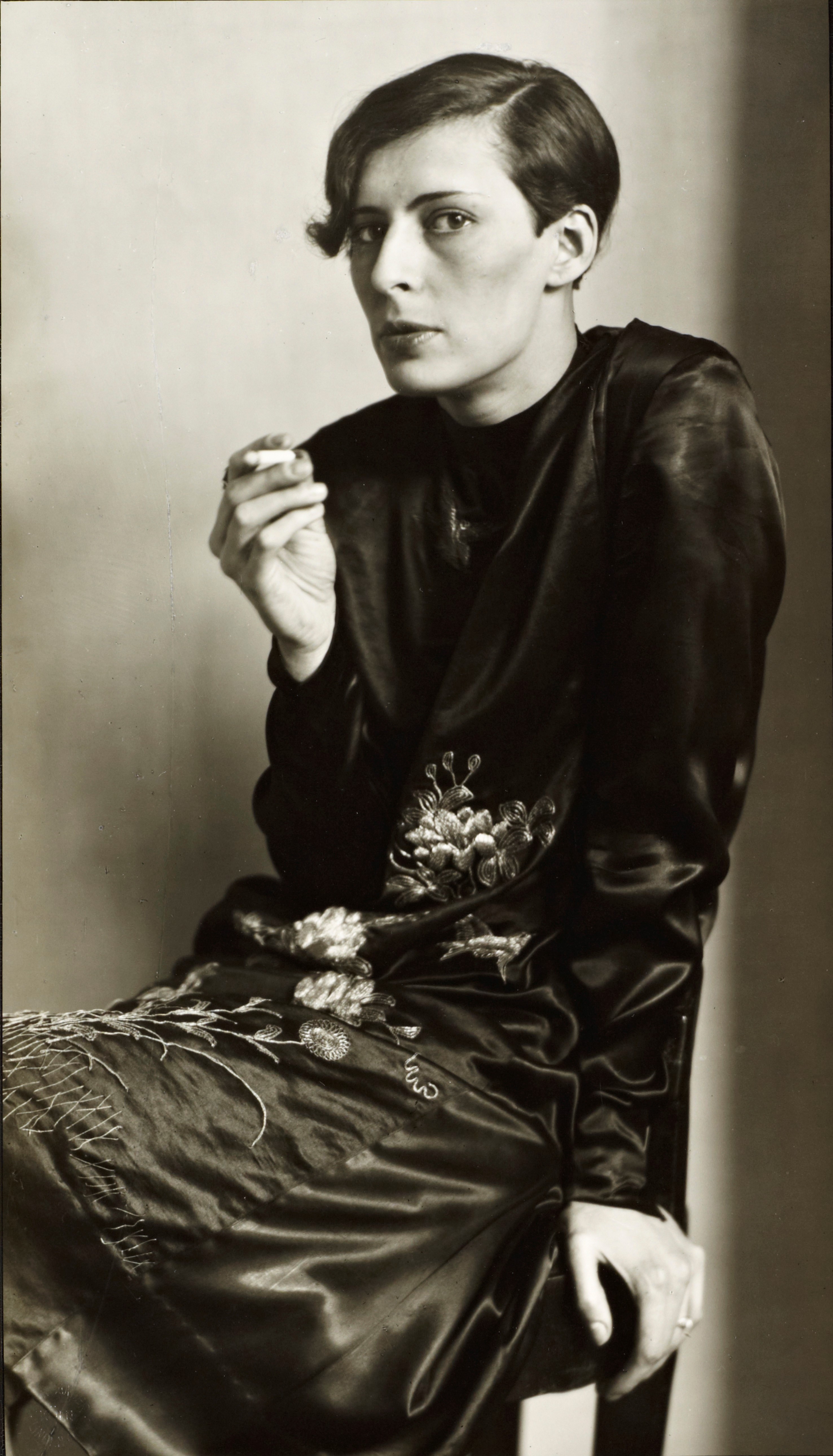
August Sander, 1876-1964
Secretary at West German Radio in Cologne 1931, printed 1992
Photograph, gelatin silver print on paper
260 x 149 mm
ARTIST ROOMS Tate and National Galleries of Scotland. Lent by Anthony d’Offay 2010
© Die Photographische Sammlung / SK Stiftung Kultur – August Sander Archiv, Cologne / VG Bild-Kunst, Bonn and DACS, London 2017
The Weimar period in Germany between the first and second World Wars has always fascinated me, because the outpouring of Art it produced illuminates the best and the very worst that human beings are universally capable of. Art has a pivotal role to play in acknowledging, understanding and potentially altering human perception. It can confront us with uncomfortable truths and with the timeless necessity for ongoing ethical, social and cultural reappraisal. Weimar Germany produced astonishing, disturbing and visionary work in film, literature and visual art, dancing on the edge of an abyss, or peering courageously into it as Germany descended into Nazi radicalisation. Sander and Dix were witnesses to the monumental collapse of civilization around them. Their work is testament to “magnificent beauty” and “terrible truth” of the human condition, encompassing our propensity for creation and destruction as a species. To have lived through such a time is something of an abstract to 21st Century eyes, which is why this work needs to be seen, doubly so in the times we’re now living in. This history lived visually displays how chillingly easy it is to deceive ourselves, individually and collectively. In terms of freedom of expression and tolerance, Art is a matter of life and death, something totalitarian regimes have always understood and that we forget at our peril.
The effect of seeing this exhibition may be jolting, shocking and highly confrontational to some viewers, especially in relation to the savagery of Dix’s work, but grinding poverty, dispossession and the depravity of war exist all over the world today and that should shock everyone. Sander’s epic photographic project People of the 20th Century, which began in 1910 and was still unfinished when he died in 1964, endures as a creative act of responsibility, reconnaissance and remembrance. The exhibition presents 144 photographs from the series, mixing the various categories and portfolios: The Farmer, The Skilled Tradesman, The Woman, Classes and Professions, The Artists, The City and The Last People. Sander sought to create “a social atlas of Germany”. His categorisations responded to the descent into fascism with the addition of The Persecuted and Political Prisoners portfolios, the latter made by his son Erich Sander in prison before his death in 1944. Significantly August Sander doesn’t preach or denounce, but allows the character and dignity of each sitter to speak for itself. These aren’t portraits taken for aesthetic reasons or commission, but with the objectivity demanded by the political, social, cultural conditions and constraints of the time. Sander’s lens, like his mind and heart, were egalitarian by nature. He was leftist, antifascist, aligned with the Cologne Progressives and worker’s movement, politics that made him a target for the National Socialist party. In 1936 stocks of his first book Face of our Time (German: Antlitz der Zeit), published in 1929, were confiscated by the Nazis and the photographic plates destroyed. His work was considered “un German “by the Third Reich in its essential connectivity. What speaks to the viewer across time are the faces of individuals and the humanity at the heart of Sander’s life- long project. Photographing German society according to hierarchical occupations and class was entirely in keeping with his worldview. To contemporary eyes, categorising human beings may seem extremely clinical and ironic given the systematic application of that methodology to the Holocaust. We may also perceive categories such as The Last People; idiots, the sick, the insane, and the dying or The City; Travelling People, Gypsies and Transients as dispassionate and potentially inflammatory, however Sander’s intent was inclusion, highlighting marginalisation in German society.

August Sander, 1876-1964
Disabled ex-serviceman c.1928, printed 1990
Photograph, gelatin silver print on paper
260 x 190 mm
ARTIST ROOMS Tate and National Galleries of Scotland. Lent by Anthony d’Offay 2010
© Die Photographische Sammlung / SK Stiftung Kultur – August Sander Archiv, Cologne / VG Bild-Kunst, Bonn and DACS, London 2017
In Disabled Ex-Serviceman (1928, gelatin silver print on paper) for example, we see the human cost of industrialised warfare in his image of an amputee at the bottom of the stairs, literally and metaphorically, unable to rise. After the disastrous First World War, the pointed gaze of the soldier confronts us with the pariah status of an entire nation and our own complicity or resistance in the world. There is no glory or heroism, just damaged, desperate lives in a climate of inflation, unemployment and poverty. Sander’s portraits affirm the relationship between photographer and sitter as one human being beholding another, appealing directly to the emotional intelligence of the viewer. Whether fixing his gaze upon a Mousetrap Salesman, Proletarian Intellectuals, Blacksmiths, Bricklayers, Mothers, Artists, Circus Performers, Industrialists, Philosophers or SS Officers, Sander’s grasp of humanity allows him to craft an image of everyone without judgement, a quality that should never be mistaken for neutrality. The eyes of his sitters meet ours in moments of recognition that are immensely powerful, poignant and prophetic. We see in Sander’s photographs so many people who would have been reclassified by the Third Reich as less than human. We will never know how many of these people were tortured, starved and murdered as part of Hitler’s “Final Solution”. Political activists, so called “degenerate” artists, disabled people, homosexuals or anyone of non-Aryan descent were all marked for extermination by the regime. Thankfully in Sander’s work we can still see some of their faces, long after the generation who survived WWII have passed.
One of my favourite Sander images is Girl in A Fairground Caravan (1926-32, silver gelatin print on paper). Framed by a small window with just her head and shoulders visible, her hand extends to the outside lock on the door, within a stain-like pattern on the side of the caravan. On the cusp of adulthood her face is solemnly fixed on the viewer, poised, wary, with eyes far older than her years. Far from a youthful, carefree existence, we feel her confinement and the edge of trust in the camera as witness. It is an intensely psychological portrait of a threshold stage of life and its attendant fears, together with a burgeoning climate of isolation and persecution. With the hindsight of history, the caravan resembles a railway carriage. Whenever I look at this photograph I wonder what became of this young woman, how her story unfolded in the gathering storm and whether she survived, existed or eventually prospered. Sander’s images are timelessly potent in that respect. Even though many of his sitters are nameless, they are real, relatable and hauntingly empathic, as fragile as we all are in the midst of events we cannot control. The girl looks as though in the next moment she could turn the key in the lock and step outside, but here she remains, held in a single breath of hesitation, suspended forever in the photograph between childhood and adulthood, life and death.
There’s unexpected beauty and grace in Sander’s image of two Blacksmiths (1926, silver gelatin print on paper), part of the Skilled Tradesman / The Worker- His life and work portfolio. The older man, hammer in hand is so positively strong, proud and confident in his skill, gained through years of experience. We feel that he is at a stage of life where he is comfortable in his own skin, whilst his younger apprentice, with a heavily defined and doubtful, creased brow, hasn’t matured into his profession or himself yet. Side by side with the anvil between them they are level, part of an endless cycle. Humanity is Sander’s baseline in every shot.

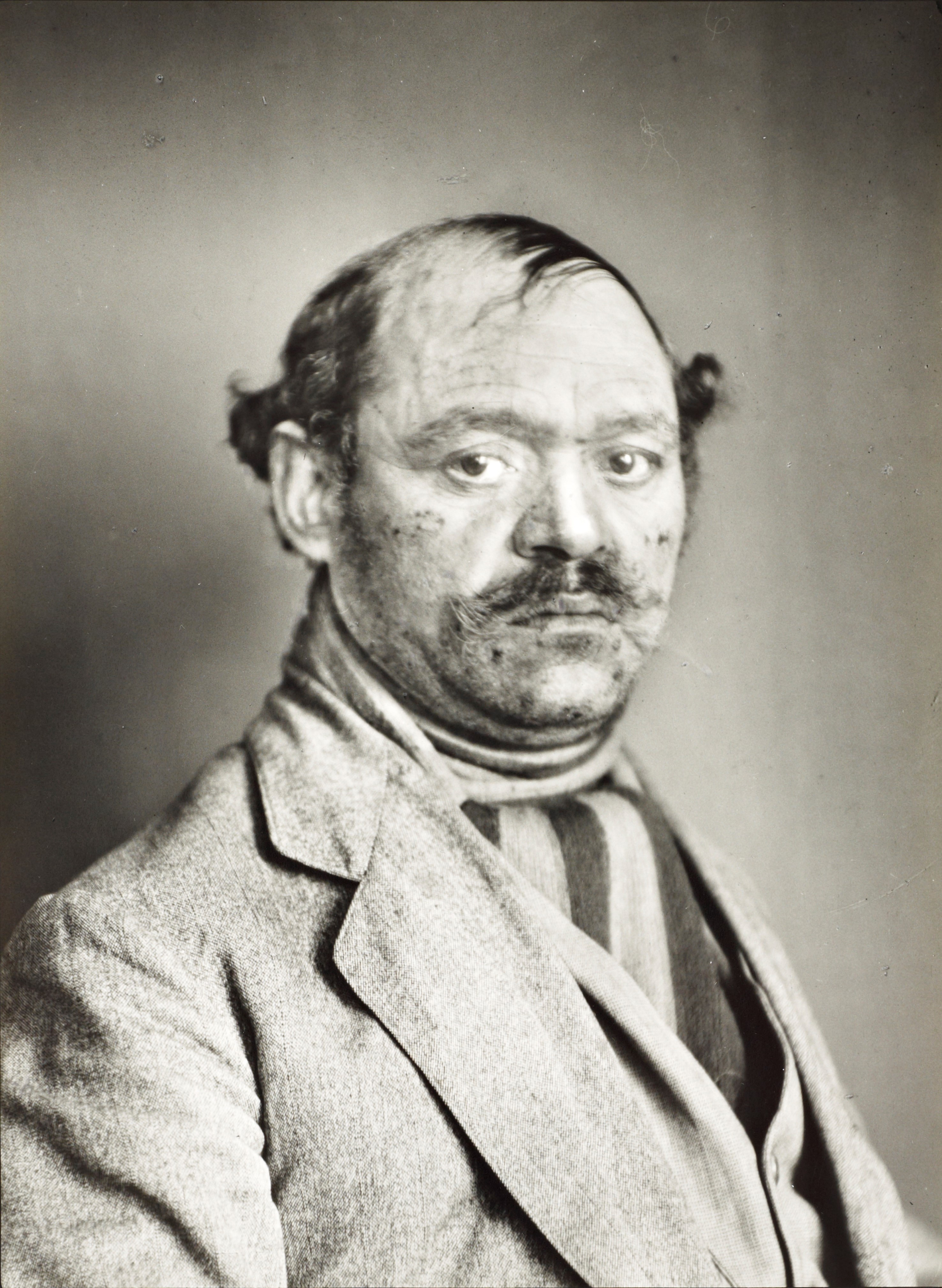
August Sander, 1876-1964
Turkish Mousetrap Salesman 1924-30, printed 1990
Photograph, gelatin silver print on paper
260 x 191 mm
ARTIST ROOMS Tate and National Galleries of Scotland. Lent by Anthony d’Offay 2010
© Die Photographische Sammlung / SK Stiftung Kultur – August Sander Archiv, Cologne / VG Bild-Kunst, Bonn and DACS, London 2017
In the photograph Turkish Mousetrap Salesman (1924-30, gelatin silver print on paper) from the portfolio The City/ Travelling People, Gypsies and Transients, we see strength, resilience, weariness, fear and sadness in the face of a man, perhaps in his late 40’s or early 50’s. His intense eyes convey vulnerability and stature, transcending his position in society. Economic hardship and uncertainty are etched across his face. Sander’s choice of a large format camera, glass negatives and long exposure times, capture with care every detail of the person. We feel the rough texture of the salesman’s worn jacket, delicate wisps of aged hair and patches of loss, his scars, beautifully defined mouth and soulful eyes. Rejecting the latest photographic equipment, Sander favoured the daguerreotype, declaring that it; “cannot be surpassed in the delicacy of delineation, it is objectivity in the best sense of the word and has a contemporary relevance.” The choice of analogue in our own time and what it signifies in terms of Craft and human values, equally so.

August Sander, 1876-1964
The Painter Otto Dix and his Wife Martha 1925-6, printed 1991
Photograph, gelatin silver print on paper
205 x 241 mm
ARTIST ROOMS Tate and National Galleries of Scotland. Lent by Anthony d’Offay 2010
© Die Photographische Sammlung / SK Stiftung Kultur – August Sander Archiv, Cologne / VG Bild-Kunst, Bonn and DACS, London 2017
Sander’s double portrait of The Painter Otto Dix and his Wife Martha (1925-6, silver gelatin print on paper) presents an interesting dynamic of equality. Martha, a fashionable socialite, faces the camera in a frontal pose, whilst her husband with his unmistakable profile is positioned behind her, blonde hair slicked back in an “American style”. We are left in no doubt that the primary subject is Martha and she’s confident in the role. The image is from Sander’s portfolio The Woman and the Man’, classified in the group ‘The Woman’, part of his ‘People of the 20th Century’ project. In spite of the classification of “wife” Martha is in no way subordinate and in her direct gaze we see a person in her own right with a strong, intellectual presence. It is a fascinating partnership which reveals itself further in Dix’s paintings and drawings of his wife, clearly in a different league to many of his other depictions of women. Referred to affectionately as Mutzli, we see her dignified profile in Woman in Gold (Mutzli) (1923, watercolour, gold paint and pencil on paper), her face partially concealed by a sophisticated, decadent hat. In Dix’s beautiful drawing Portrait of Mutzli Koch (1921, pencil on paper) we see only her face and neck, draped in the suggestion of a luxurious fur, hair pulled back into a bun with arched eyebrows framing her gaze. Dix draws the curve of her cheekbones, nose and cat -like almond eyes with the strength and delicacy of a caress, every mark declares his love for her, a quality more frequently absent from his Art. The tenderness and sensuality in this drawing is equally met by Mutzli’s direct gaze at Dix. The artist’s picture books for Hana, his wife’s child from her first marriage, are fantastic and delightful, with scenes from Fairytales, the Bible and hybrid creatures rendered in watercolour and pencil. Although they are not without a Dixian edge, fused with the dark spirit of the brothers Grimm! Dix’s Bremmen Town Musicians, part of his Cornucopia for Hana (1925) are rather demonic looking in contrast with scenes such as Knight Hans at Hoher Randen and His Family on Horseback with its bright, buoyant palette. This aspect of the artist’s work, combined with domestic family life is a recent discovery, bringing a surprising dimension to an artist famed for his acute lack of empathy.

Otto Dix, 1891-1969
Assault Troops Advance under Gas (Sturmtruppe geht unter Gas vor) 1924
Etching on paper
196 x 291 mm
Otto Dix Stiftung
© DACS 2017. Image: Otto Dix Stiftung
Serving as a machine gunner in WWI, Dix was exposed to unspeakable violence and killing on an unprecedented scale. We cannot begin to imagine the horror of trench warfare, the loss of life or the social disintegration which followed the annihilation of an entire generation, but in his series of 50 etchings War/ Der Krieg (1924) Dix gives insight to his experiences on the front line, attempting to purge himself
“All art is exorcism. I paint dreams and visions too; the dreams and visions of my time. Painting is the effort to produce order; order in yourself. There is much chaos in me, much chaos in our time.
Like Goyas cycle of over 80 etchings and aquatints The Disasters of War (1810-1820) which he consciously studied, Dix’s War etchings are among the most powerful, visceral and damning images ever created in response to human atrocities. The process of etching was intensely physical for Dix, like scratching his wounds, a cathartic bloodletting, burning away the surface metal with acid to banish his nightmares. It is hard to describe the way that these monochrome images of a modest scale conjure the smell of death and rotting flesh, the terror of men driven mad by fear, hollowed out by exhaustion and the relentless shelling, reducing the earth to a pitted, desolate landscape of body parts. Dix leads us into his memories of the Western Front, battlefields where the horizon is ruptured, disappearing into broken lines like lost hope. Human bodies are caught on barbed wire, impaled, mutilated by machine gun fire or dismembered by bombs. Surprisingly one of the most disturbing images is the most still, completely uninhabited by the human figure. Shell Holes near Dontrien Illuminated by Flares (1924, etching on paper, 195 x 260 mm, Otto Dix Foundation, Vaduz), conveys a moment of profound, out of body stillness, when the world slows in the face of severe shock and trauma. This is a print that you can actually hear, held in the breath of the artist/witness and the viewer beholding it. It is an image etched in my mind forever.

Otto Dix, 1891-1969
Dying Soldier (Sterbender Soldat) 1924
Etching on paper
198 x 148 mm
Otto Dix Stiftung
© DACS 2017. Image: Otto Dix Stiftung
In Soldier and Nun (1924, etching on paper, 200 x 145mm Otto Dix Foundation, Veduz) the artist depicts the desecration of rape, placing the viewer behind the soldier in the composition. This voyeuristic positioning on the threshold mirrors the scene before us, amplifying the horror of bearing witness. There is also, in the context of Dix’s oeuvre, a very uncomfortable edge of complicity in how the image is composed. The print was withheld from the original cycle, deemed too shocking to be shown, but like all of Dix’s war etchings it is a document of modern warfare that needs to be seen and acknowledged. Dix’s Sex Murder (Lustmord) (1922, Etching on paper, 275 x 346mm, private collection, courtesy of Richard Magy Ltd, London) displays a bloody crime scene, clotted in black with two dogs copulating in a corner like a cartoon. There is no empathy in Psychopathy and none here either in the rendering of the female figure as a mutilated, discarded doll. The misogynist violence in early pulp fiction, the plotlines of contemporary thrillers, TV cop shows and interactive games like Grand Theft Auto aren’t so far removed from Dix’s Sex Murder as a recurrent obsession in 20th and 21st century popular culture. Dix often depicted himself as a predatory, lurid and monstrous figure in his work. He projects severity and power in his self-portraits, a veneer of fashionable respectability that is prone to disintegration in the fluid immediacy of his watercolours and hard-edged drawings. Dix displays his own morality and logic in chaotic and highly disturbing scenes which would be confessional if they weren’t so entirely without remorse.

Otto Dix, 1891-1969
Corpse Entangled in Barbed Wire (Leiche im Drahtverhau) 1924
Etching on paper
300 x 243 mm
Otto Dix Stiftung
© DACS 2017. Image: Otto Dix Stiftung
There is undeniable madness, depravity, societal decay and death in Dix’s Neue Sachlichkeit /New Objectivity, elements shared with fellow artists George Grosz and Max Beckmann. Satirical and abhorrent depictions of the human figure were weapons Dix and Grosz used to attack middle class complacency, the military, church and state. The unflinching reality of their work is grounded in human behavior and experience, their rejection of Romantic idealism and expressionism. In the aftermath of WWI and the “Golden Age” of the roaring 20’s, Dix declared that;
“People were already beginning to forget, what horrible suffering the war had brought them. I did not want to cause fear and panic, but to let people know how dreadful war is and so to stimulate people’s powers of resistance.
Whilst I don’t doubt the artist’s intention of resistance, there is also an aspect of his personality, arguably unleashed by his war time experiences, which revels in the adrenalin fueled excitement of killing and sexual violence. It is a source of masculine power for Dix, coupled with personal revulsion and disgust. The artist’s commitment to depicting “life undiluted”, to “experience all the darkest recesses of life in order to represent them” is a double-edged credo. He admitted that “the war was a horrible thing, but also something powerful. I was not about to miss it. You have to have seen people in this untethered state to know something about humans”. Dix’s response to what he saw around him, later manifested in immersion and participation in the underworld of Weimar Germany’s streets, nightclubs and brothels, a search for truth devoid of nobility or redemption. His works on paper explore a nocturnal world distorted by fear, loathing and collective psychosis.

Otto Dix, 1891–1969
Reclining Woman on a Leopard Skin 1927
(Liegende auf Leopardenfell) 1927
Oil paint on panel
680 x 980 mm
© DACS 2017. Collection of the Herbert F. Johnson Museum of Art, Cornell University. Gift of Samuel A. Berger; 55.031.
Dix’s grotesque, almost hallucinogenic depiction of prostitutes and their clients, including sailors and soldiers (including himself), achieve a heightened state of animalistic abandon and debauchery. Even his society portraits, rendered with the finest technical precision, amplify the prevailing sense of Nietzschean annihilation, a philosopher Dix was drawn to at an early stage of his development. The artist’s extremism is centred on the body, in the coupling of sex and death, the dominance of instinctual drives and inevitable decay, which he projects onto the human figure as Germany personified. His iconic portrait of nightclub dancer Anita Berber (1925) in garish, pursed lip red is a parody of glamour. Reclining Woman on a leopard Skin (1927, Oil paint on panel, 680 x 980mm, Collection of the Herbert F. Johnson Museum of Art, Gift of Samuel A. Berger, 55.031) is a superb example of the dangerously mesmerising spirit of the age. The woman in the painting with her cat-like eyes and claw-like hands holds the mask of her pale, made up face temporarily in place, coiled like a caged animal about to strike. The red folds of fabric and leopard skin feel strangely alive, with the figure positioned in the draped, though spartan, recess of a boudoir/ lair. The acidic green gossamer dress garishly clashes with opposing red, while the woman’s glazed eyes are remarkably cold and fixed, seeing right through to the flesh and blood that you are. In the background a Hyena-like creature lurks in the darkness, teeth bared, a manifestation of raw instinct and animus/anima depending on your point of view. The arrangement of the body is a series of highly articulate serpentine curves, painted with consummate skill. The calculation in this image is frighteningly compelling, concealed and revealed by the artist’s technique. We sense that we are only a second away from the mask of the subject or artist being torn away and that anticipatory tension permeates much of Dix’s work.
In Vanitas (Youth and Old Age) (1932, tempera and oil paint on canvas) the subject is at once a rendering of Death and the Maiden, derived from the medieval Dance of Death and a visual statement of Dix’s contemporary Germany. The proudly smiling, golden haired nude, every inch a beamingly healthy Aryan maiden, could easily be a poster girl for the Nazi propaganda machine. However, Dix places her on a distinctive edge of shadow, framed in judgement within an allegorical tradition. We feel immediately that she would not be out of place in a tableau of the Seven Deadly Sins. Her expression is so righteous and sure of itself that it is faintly ridiculous, whist a skeletal crone hovers in the background. It’s a reminder that the girl in the foreground is just food for worms as we all are and that her idealised beauty is preposterously shallow. It’s an ugly, repulsive image in the association between ethics and aesthetics, but that is precisely the point. The artist’s rendering of the figure is sharp as a blade in his exposure of the subject as part of a cultural tradition of seeing.
Dix was acutely aware of his German artistic heritage like a Faustian pact. His use of tempera techniques, oils and the woodcut reflect the influence of German Renaissance masters such as Albrecht Dürer, Lucas Crannach the Elder and Hans Holbein. The fastidious delicacy of his paint handling meets the savagely critical depiction of the rich, privileged and famous. Even at this level, flattery is exceedingly rare in a Dix painting and sentimentality categorically dead. Then as now, the gap between rich and poor was ever widening and Dix captures the outrage and repugnance of those conditions, whilst denying political motives in his art. His searing body of work remains anti-war, in spite of the revelry he conveys in minute details of violence. The objective recognition and striking calm of a prostitute meeting the gaze of the artist in Dedicated Sadists (1922, Watercolour, graphite and ink on paper, 498 x 375mm), suggests that although Dix defended his art as a moral imperative, on a deeper, personal level he is confronting aspects of himself with the same brutal honesty. Dix’s humanity ultimately resides in his complexity as a man and an artist, holding up a mirror to the ugliness every human being is capable of. Dix doesn’t just paint, etch and draw death as the great human leveller, he strips it naked and makes no apologies.
There is a profound sense of darkness, light and the internal struggle between the two present at the beginning of his practice, when Dix was experimenting and finding his voice. Birth (Hour of Birth) (1919, Woodcut print on paper, 180 x 156mm, Galerie Remmert und Barth, Düsseldorf) in starkly, chiselled monochrome is a fine example. The sun and moon are attendants, the nipples and belly button are stars in a body bisected by the absolute values of black and white. The child’s path into the world is, at least initially, an angular projection of light from its mother’s open thigh. There is a trajectory of fate in this black and white vision of the world that feels inescapable. Dix’s painting Longing (Self Portrait) (1918-19, Oil on Canvas, 535 x 520mm, Galerie Neue Meister, Staatliche Kunstsammlungen Dresden) is a fractured face in deep blue/ black with red mouth agape, a man divided between a quartet of dualistic elements. Between sun and moon, the impulse of life in the pink embryonic form in the top right-hand corner and a red devilish goat in opposition. A green star and branch springing from the artist’s head implies creativity and intellect as the anguished man’s only means of survival and integration.
Dix had eight works in the infamous “Degenerate Art Exhibition” held in Munich in 1937. He lost his teaching position and 260 of his works were confiscated by the Nazi’s between 1937 and 1938, some of them destroyed. Looking around this phenomenal exhibition, it is a miracle that the works we see today survived. Like Dix, August Sander created a prolific body of work and whilst their images may confront us with uncomfortable truths, their New Objectivity is pertinent to unfolding events on the contemporary world stage. We are witnessing the largest displacement of people ever seen since WWII, growing inequality, economic turmoil, modern slavery, increasing radicalisation of politics and the threat of environmental catastrophe. In viewing this exhibition, we cannot hide from the powers of creation and destruction wrought by human hands and are forced to examine our own resistance, complicity and responsibility for the history we are making today.
Tate Liverpool, Portraying a Nation Germany 1919 – 1933 exhibition trailer:
gclid=EAIaIQobChMI3o_qrqyd1gIVybvtCh14pQAWEAAYASAAEgLm3fD_BwE